Most therapy websites look the same. Stock photo of a couch, a neutral blue palette, and a headline that says something like “You deserve to feel better.” It’s not bad exactly, it just blends in.
And when someone is looking for a therapist, blending in is not a great strategy.
The best website design for a therapy practice does something harder. It communicates safety, professionalism, and personality all at once.
It loads fast on a phone, guides visitors to book a session, and doesn’t make people work to figure out what you do or who you help.
I pulled together 18 real therapist websites that do this well. Some are polished and minimal. Some are bold and colorful.
A few use illustrations instead of photography. But all of them have something specific worth learning from. If you’re looking for modern website design inspiration for a therapy or mental health practice, this list is a good place to start.
Note: These are only my personal opinion.
What the Best Therapy Websites Have in Common
Before the examples, a quick note on what separates a forgettable website from a strong one.
Clear copy always beats clever copy. Visitors should know within three seconds who you help, how, and what to do next. Hierarchy matters too. The eye needs a path to follow, from the headline down to the CTA. And responsiveness is non-negotiable. More than half of web traffic is mobile, so a site that only looks good on desktop is already failing a big chunk of its audience.
With that said, here are 18 of the best therapist website designs worth paying attention to.
1. New York City Psychotherapists
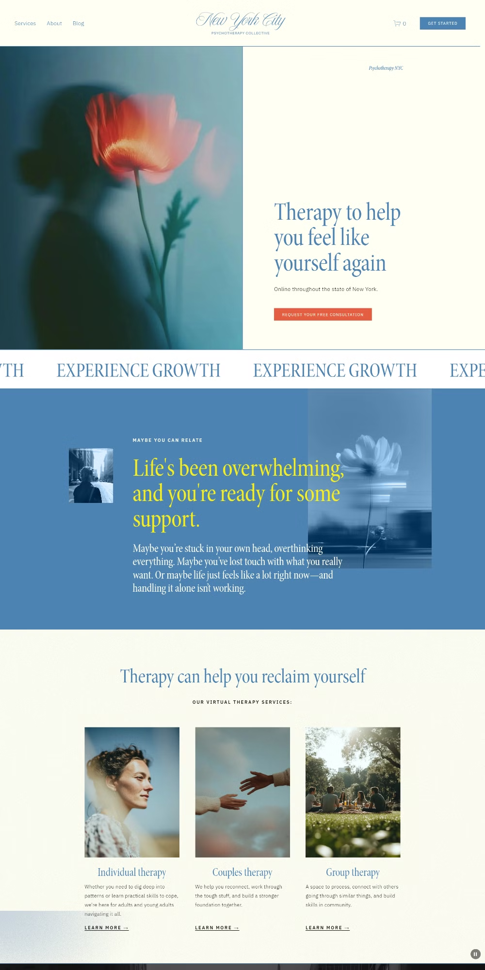
Platform: Squarespace
What Makes It Good: The color palette here is warm and considered, nothing that screams clinical, nothing too trendy. The serif headings do a lot of heavy lifting. They signal premium and trustworthy without being stiff. The page hierarchy is well thought out too. You always know where you are and what to read next. It’s one of those sites where the design gets out of its own way and lets the content do the job.
Live Link: newyorkcitypsychotherapists.com
2. Expansive Therapy
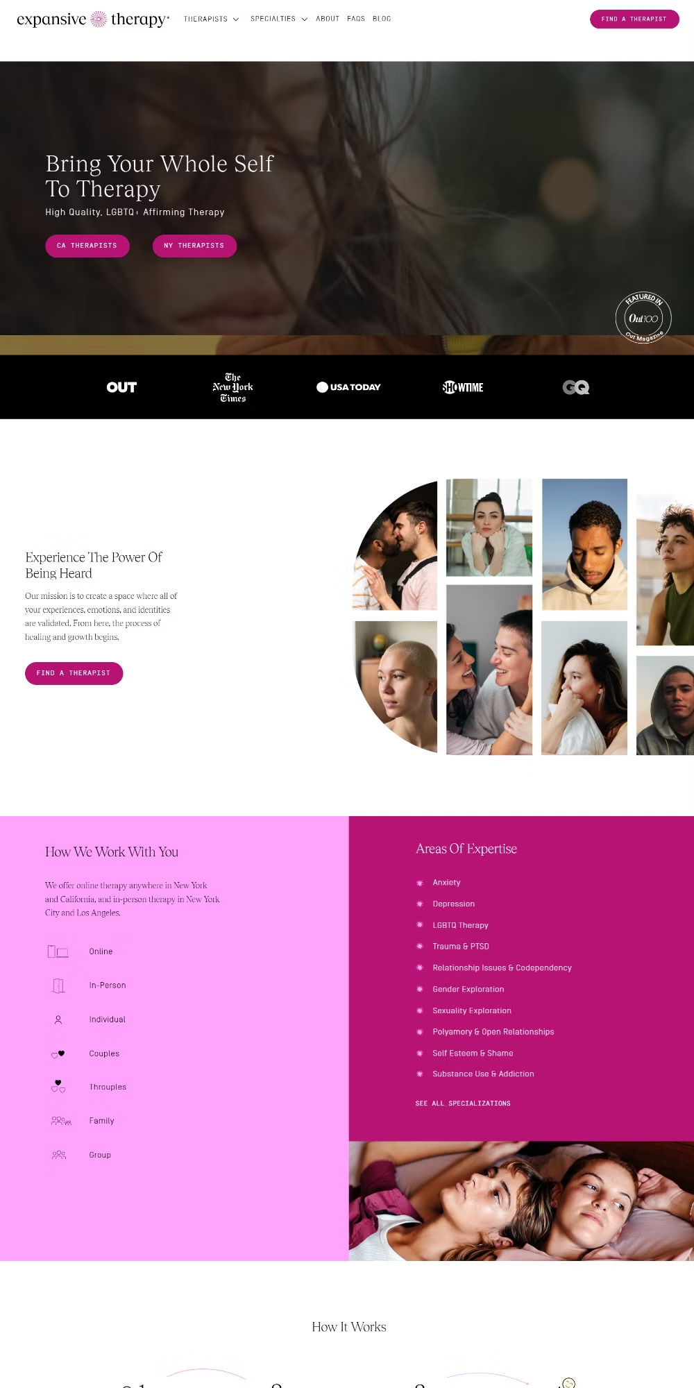
Platform: Custom Coded
What Makes It Good: The hero video background is a bold choice and it pays off. It adds energy to a category that usually plays it very safe. The bright pink palette is distinctive enough to be memorable. The copy is clear and the CTAs are placed where your eye naturally lands. This is a good example of professional website design that takes a real creative risk and pulls it off.
Live Link: expansivetherapy.com
3. Downtown Somatic Therapy
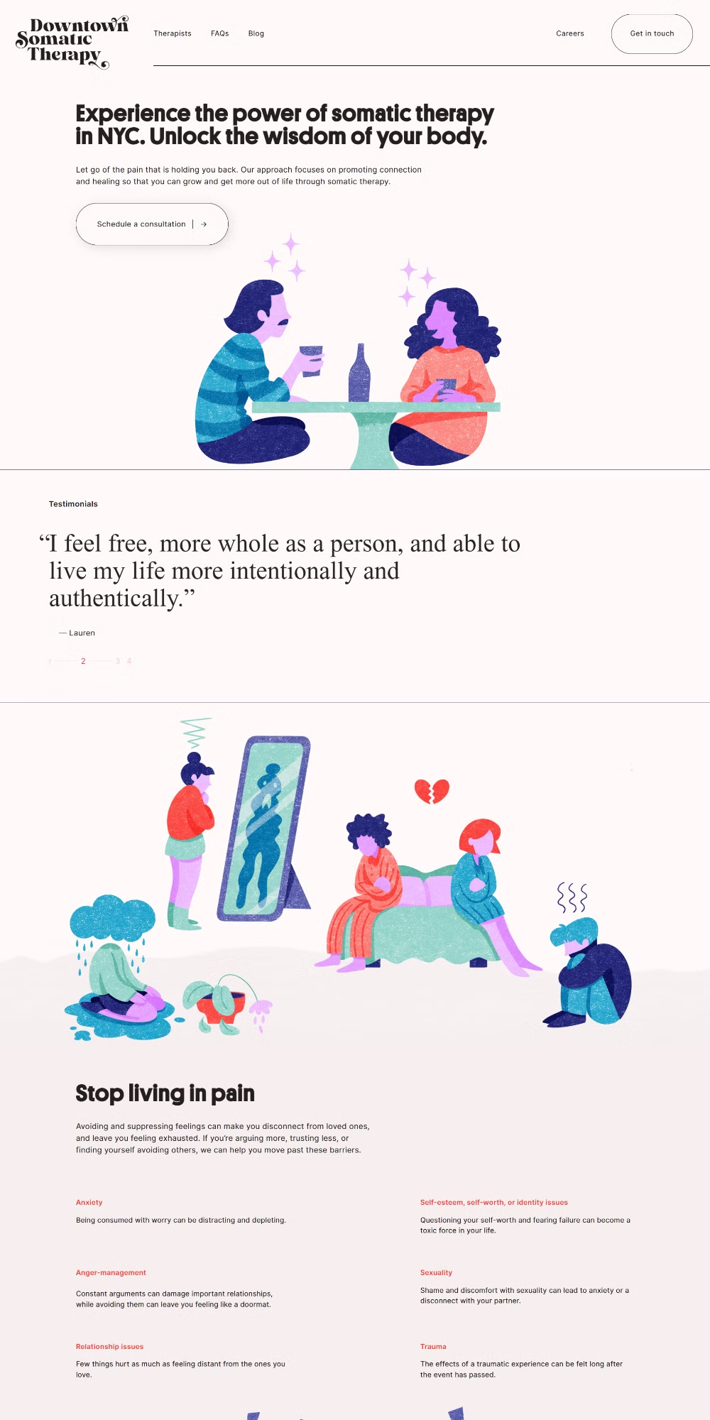
Platform: Squarespace
What Makes It Good: Bold, chunky sans-serif type makes an immediate impression. The illustrations are custom-feeling and add warmth without being childish. There are micro-interactions throughout, small hover states and transitions that make the site feel alive. The CTA is big and hard to miss. This is the kind of small business website design that punches well above its weight.
Live Link: downtownsomatictherapy.com
4. Natalie LMHC
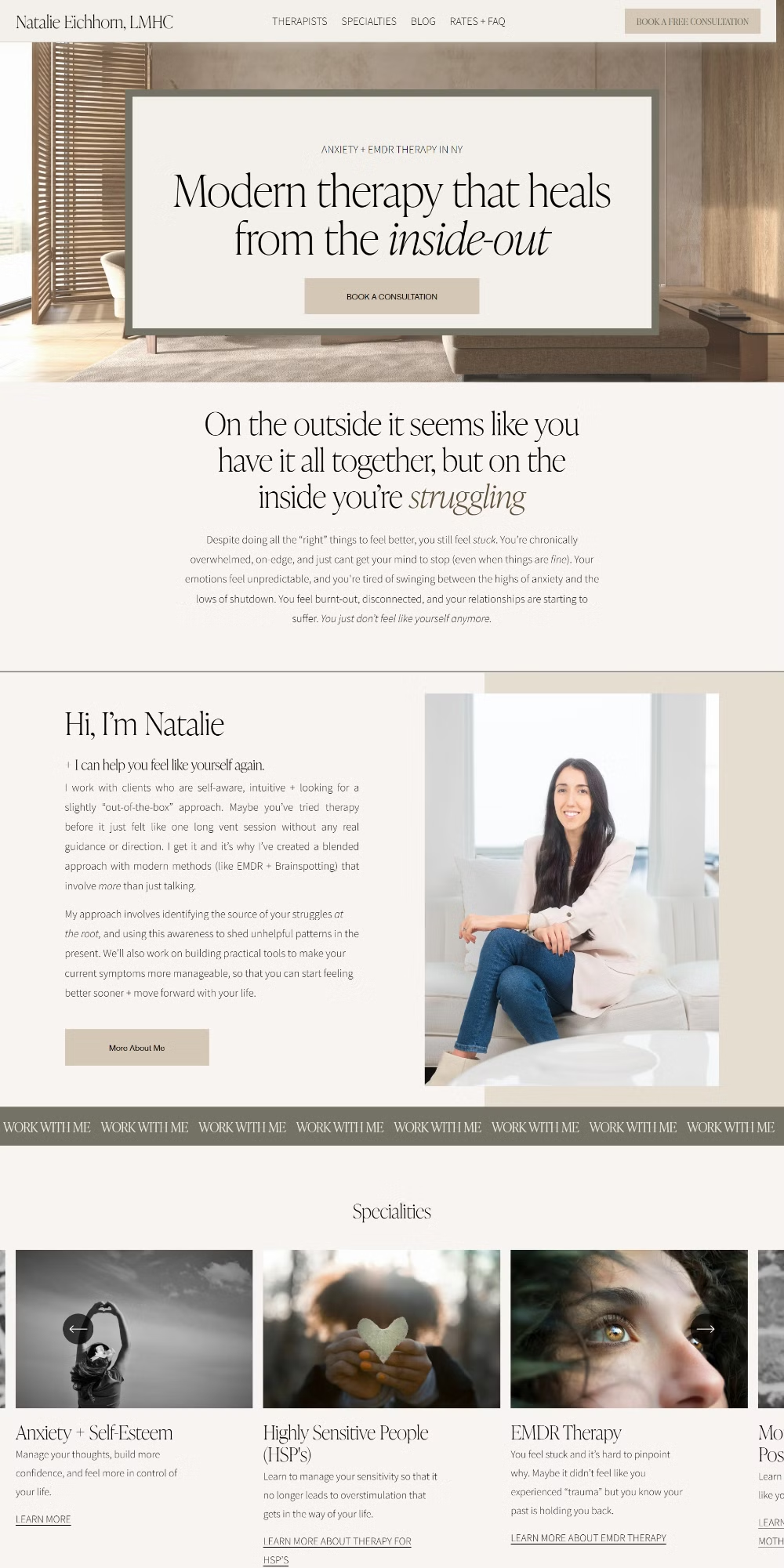
Platform: Squarespace
What Makes It Good: Clean serif fonts set a calm, professional tone from the first scroll. The entrance animations are subtle. They don’t distract, they just give the page a little breath. The pastel palette is soft without feeling washed out, and the structure is easy to follow. You get the information you need without hunting for it.
Live Link: natalielmhc.com
A quick note on fonts and color
You’ll notice a pattern across several of these sites. Serif fonts for headings, soft or pastel palettes, and plenty of white space. That’s not a coincidence. Serifs carry a sense of credibility and warmth that sans-serifs sometimes lack in this context. Pastels feel calming, which is exactly what a therapy client wants to feel before they even read a word. If your current site uses a generic sans-serif and a corporate blue, swapping those two things alone can make a real difference.
Responsive website design is part of this too. These layouts hold up on mobile because the type scales properly, buttons are tappable, and nothing gets cut off. That’s a baseline, not a bonus.
5. A Good Place Therapy
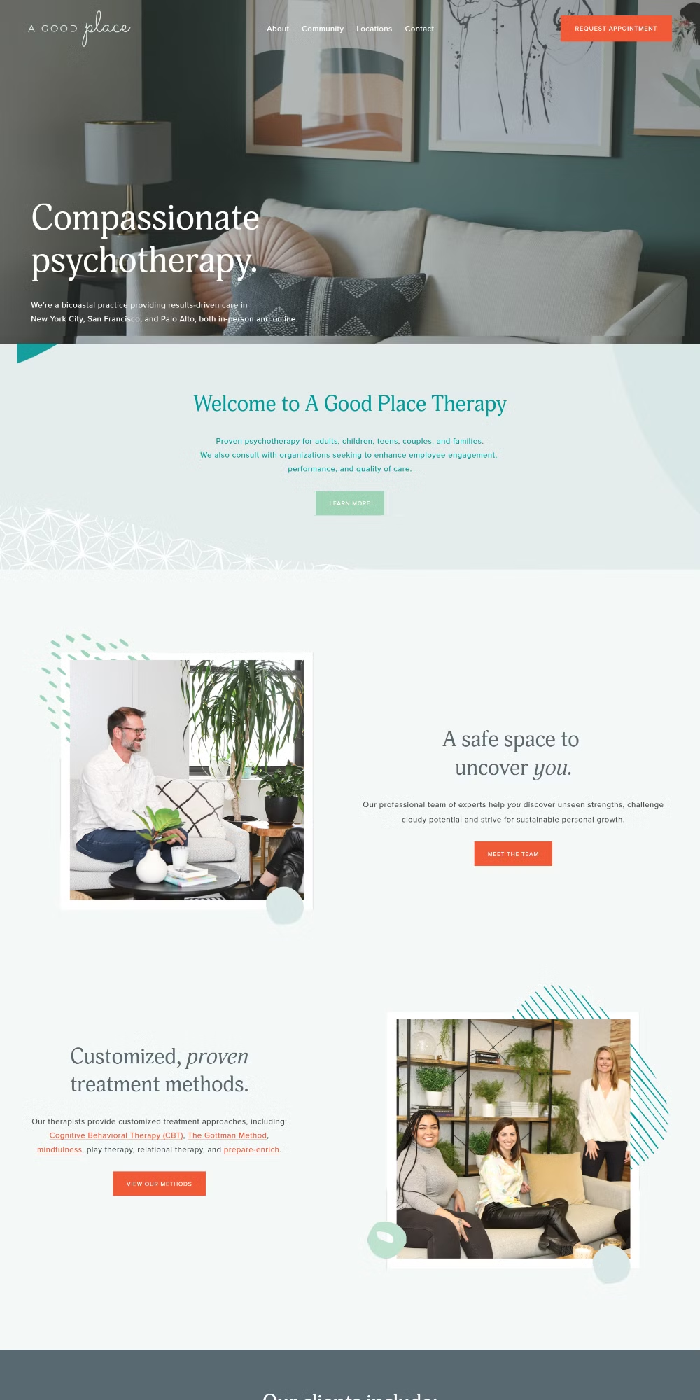
Platform: Squarespace
What Makes It Good: Clean serif fonts throughout and entrance animations that feel considered rather than automatic. The structure is one of the cleaner ones on this list. Each section has a clear purpose and the visitor is never left wondering what to do next. It’s a straightforward execution of good design principles and that’s exactly what makes it work.
Live Link: agoodplacetherapy.com
6. Manhattan Modern Therapy
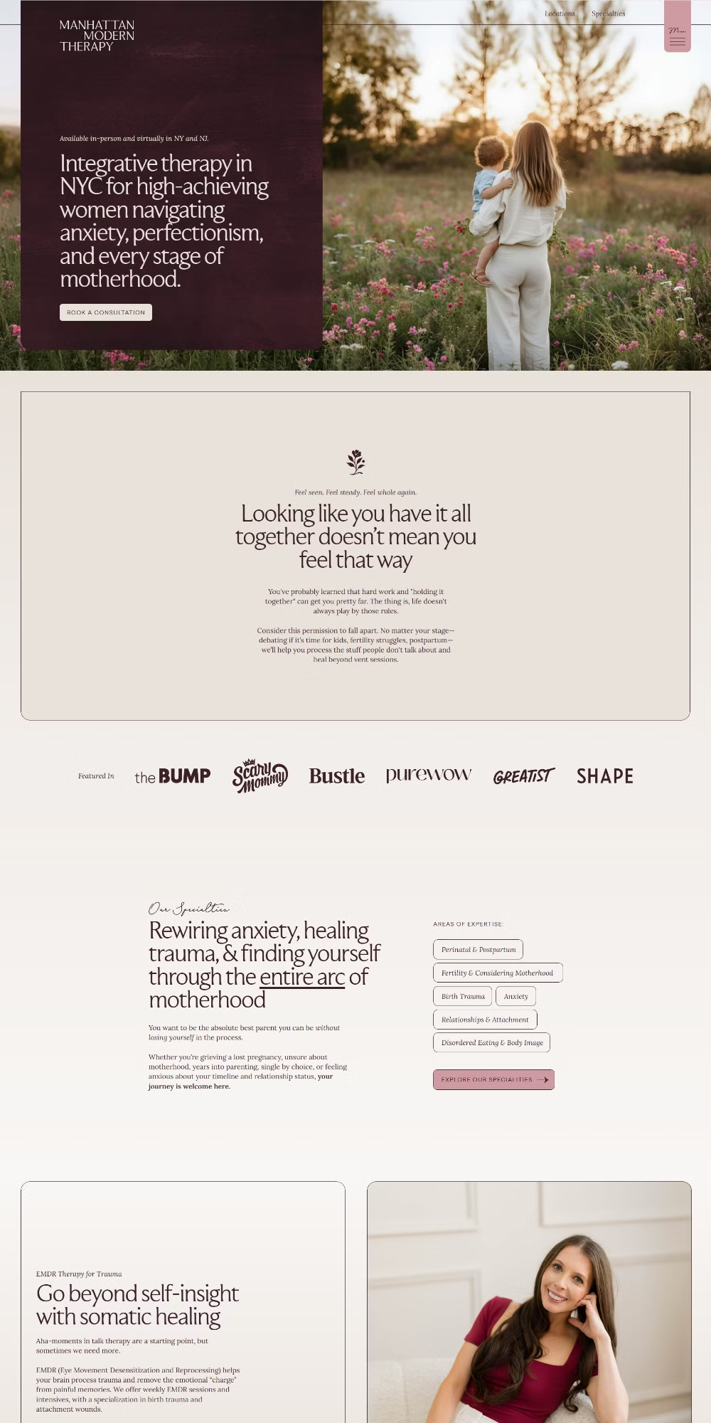
Platform: Showit
What Makes It Good: The color palette is the standout here. A deep reddish tone paired with soft pastels gives the site a personality that’s hard to forget. It’s warm but sophisticated. The structure is excellent too. Every section flows into the next without feeling forced, and the serif fonts tie everything together with a sense of authority.
Live Link: manhattanmoderntherapy.com
7. Being Health
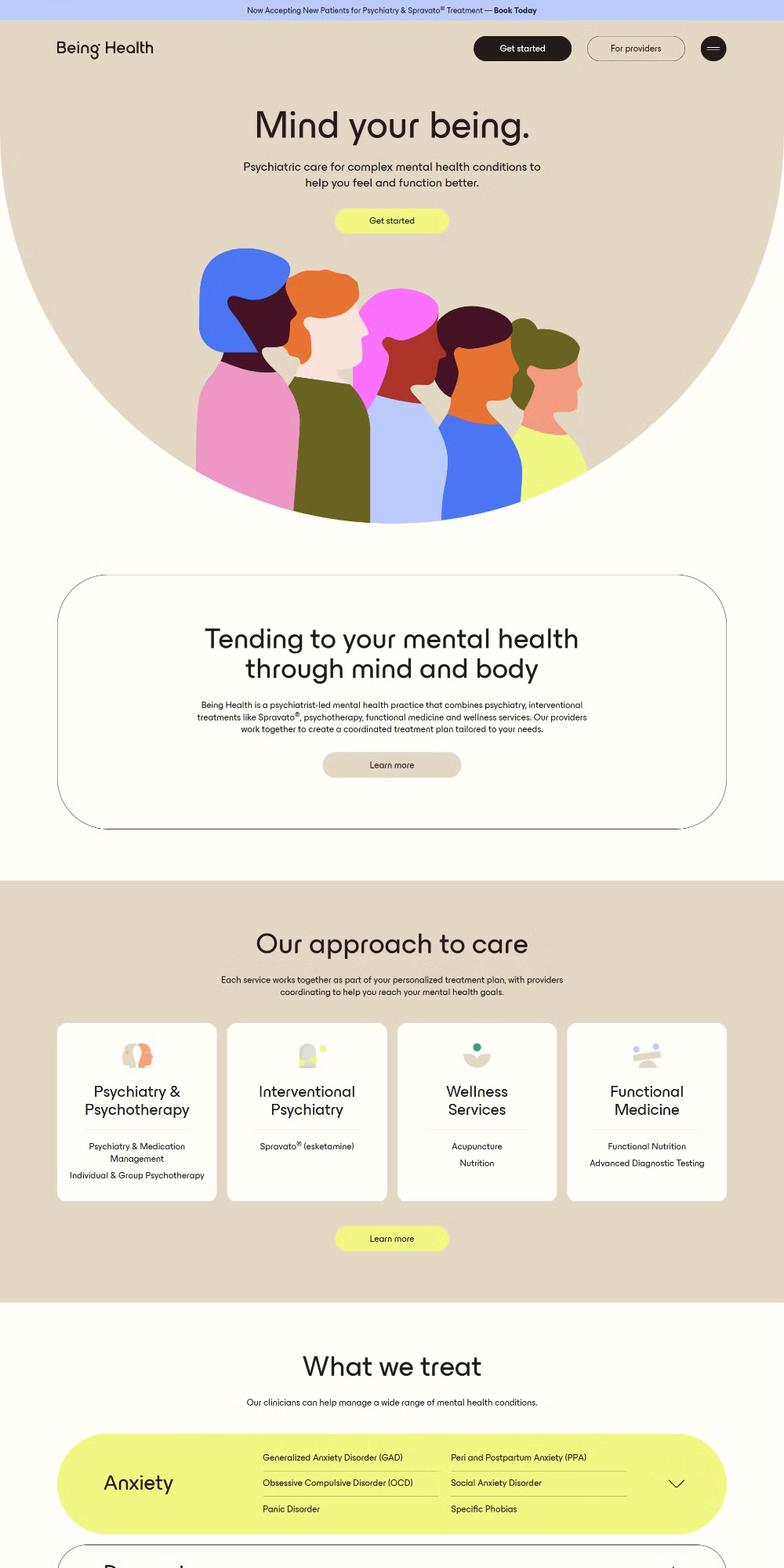
Platform: Webflow
What Makes It Good: Illustrations replace stock photography here and it works really well. The copy is clear and the layout doesn’t overcomplicate things. When a site uses custom illustration instead of generic photos, it immediately feels more considered. It tells the visitor that someone put real thought into this brand, and that builds trust.
Live Link: beinghealth.co
8. New York CBT
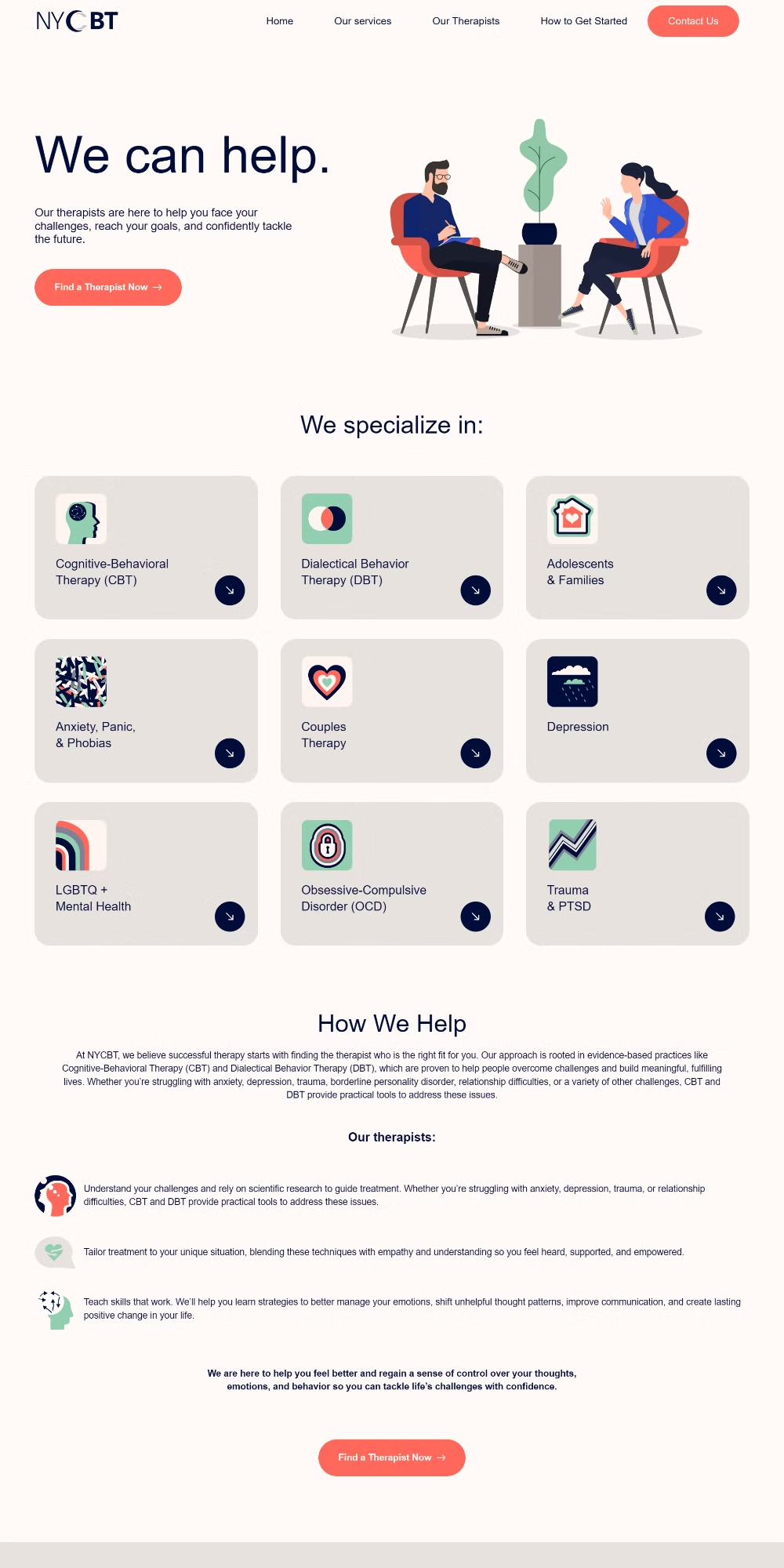
Platform: WordPress
What Makes It Good: Similar approach to Being Health. Illustrations keep things feeling human without relying on staged photography. The copy is to the point and the design doesn’t clutter the message. The layout hierarchy is clean and easy to scan, which matters a lot on mobile where visitors are scrolling fast.
Live Link: newyorkcbt.com
On illustrations vs. photography
Two sites on this list, Being Health and New York CBT, skip stock photos entirely and use illustrations instead. It’s worth considering why that works. Stock therapy photos are often awkward. A woman staring thoughtfully out a window. A smiling therapist holding a clipboard. Illustrations sidestep all of that. They’re abstract enough to feel inclusive and warm enough to feel human. If your current site relies on generic stock images, illustrations might be worth exploring.
9. Through Heart Therapy
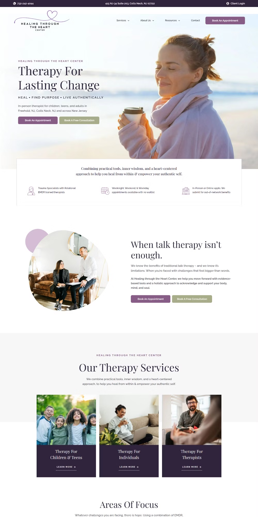
Platform: WordPress
What Makes It Good: No visual noise. Clean fonts, clear copy, a good CTA. The structure is tight and direct. Sometimes the best website design is the one that doesn’t try to do too much. This site knows what it needs to communicate and it does exactly that without adding anything that doesn’t serve a purpose.
Live Link: throughhearttherapy.com
10. Divya Dodhia
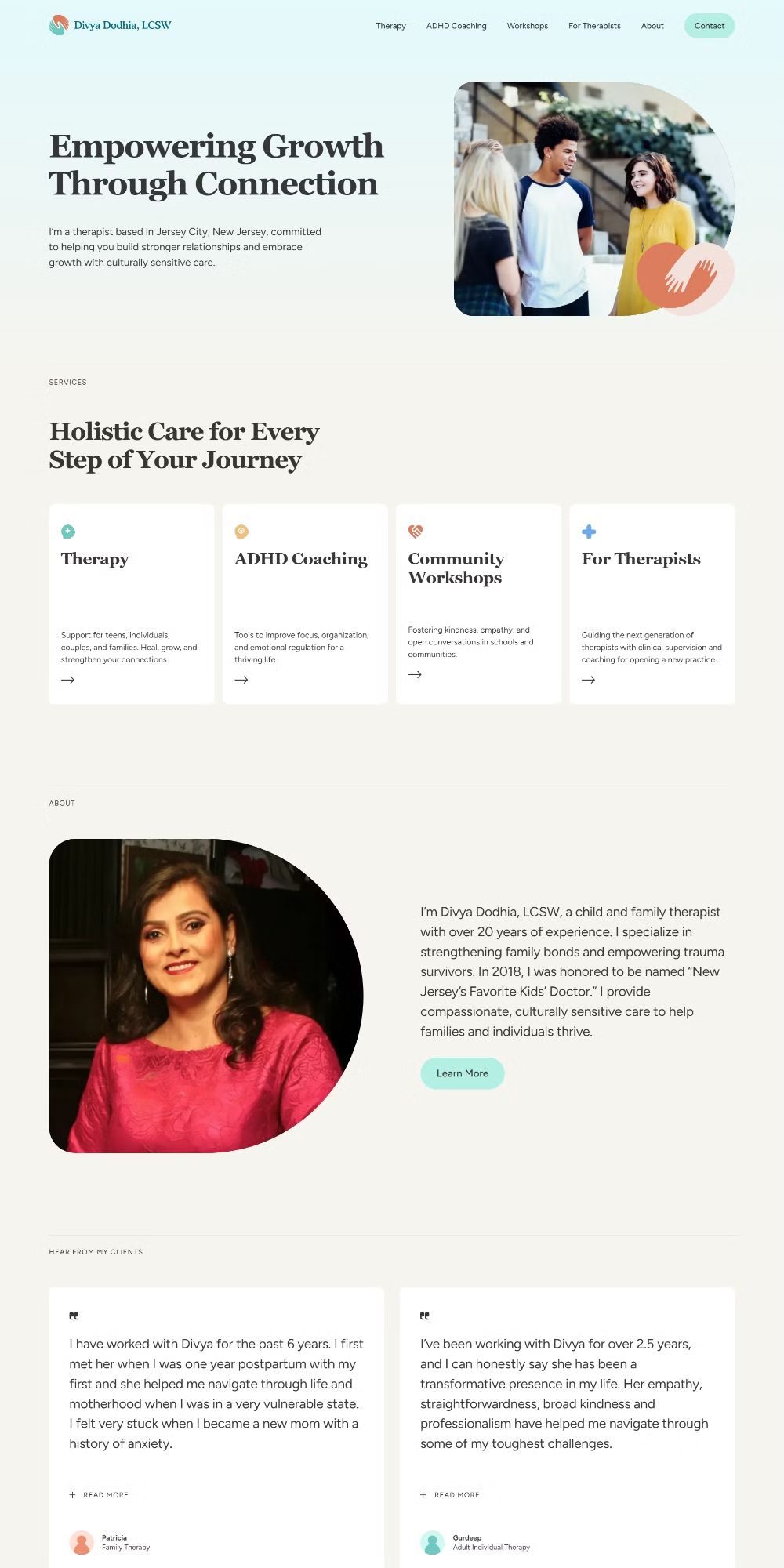
Platform: Webflow
What Makes It Good: A light use of illustration adds personality without taking over. The serif fonts are clean and the entrance animations feel intentional rather than decorative. The structure is one of the strongest on this list. Every element is where it should be, the hierarchy is easy to read, and there’s nothing pulling the eye in the wrong direction.
Live Link: divyadodhia.com
11. Unscripted Therapy
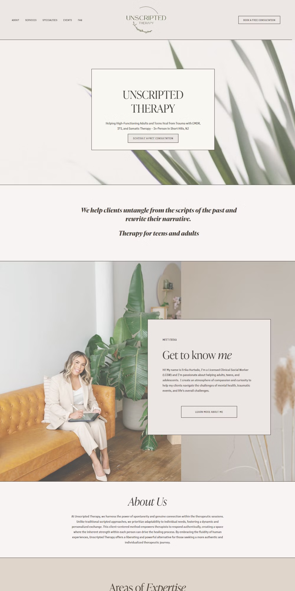
Platform: Squarespace
What Makes It Good: This one takes a different approach. Dark bordered sections and containers give the layout a structured, editorial feel. It’s minimalistic but not cold. The serif font keeps the warmth in and the clear structure makes it easy to navigate. It’s a good example of how you can break from the typical therapy aesthetic and still feel trustworthy.
Live Link: unscriptedtherapy.com
12. New Life Mental Health NJ
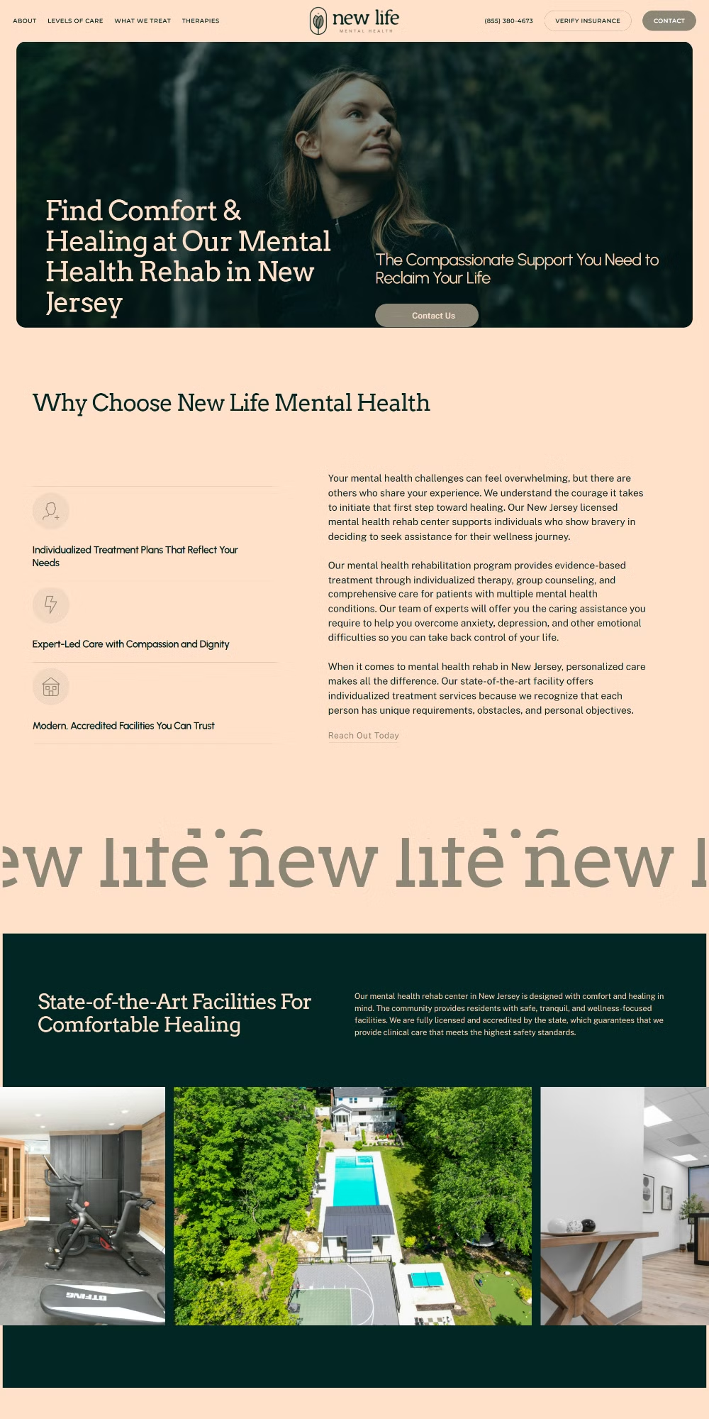
Platform: WordPress
What Makes It Good: A well-executed minimalist site. The font choice is strong, the pastel palette is calm and clean, and the animations are subtle enough that they enhance the experience without distracting from it. The copy is clear and doesn’t try to oversell. This is what good responsive website design looks like in practice: simple, fast, and easy to read on any screen.
Live Link: newlifementalhealthnj.com
13. Circle Care Services
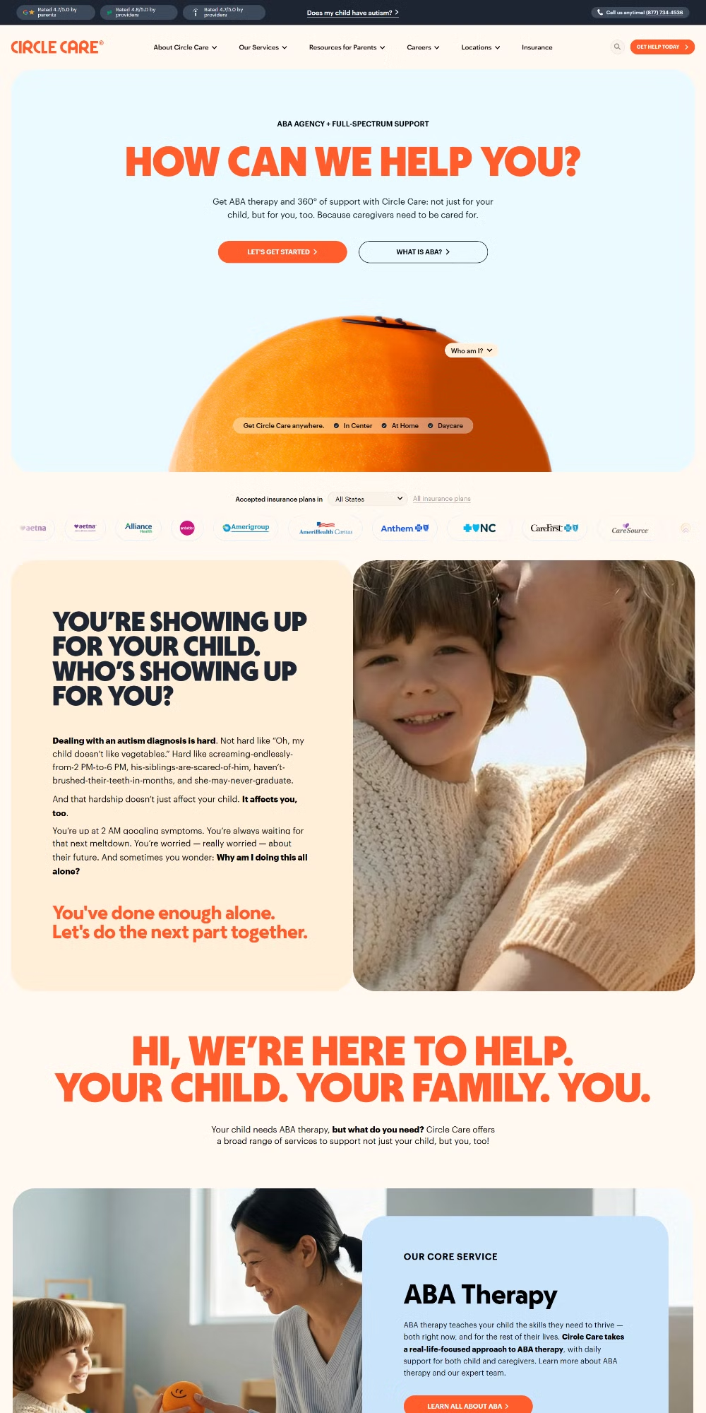
Platform: Custom Coded
What Makes It Good: Bold color and strong imagery make this one stand out in a category that tends toward muted palettes. The sans-serif fonts are readable and confident. The layout hierarchy is clean and the color choices feel deliberate. When color is used this intentionally, it signals that the brand has a point of view, and that’s a good thing for a therapy practice trying to attract a specific kind of client.
Live Link: circlecareservices.com
14. ReYou
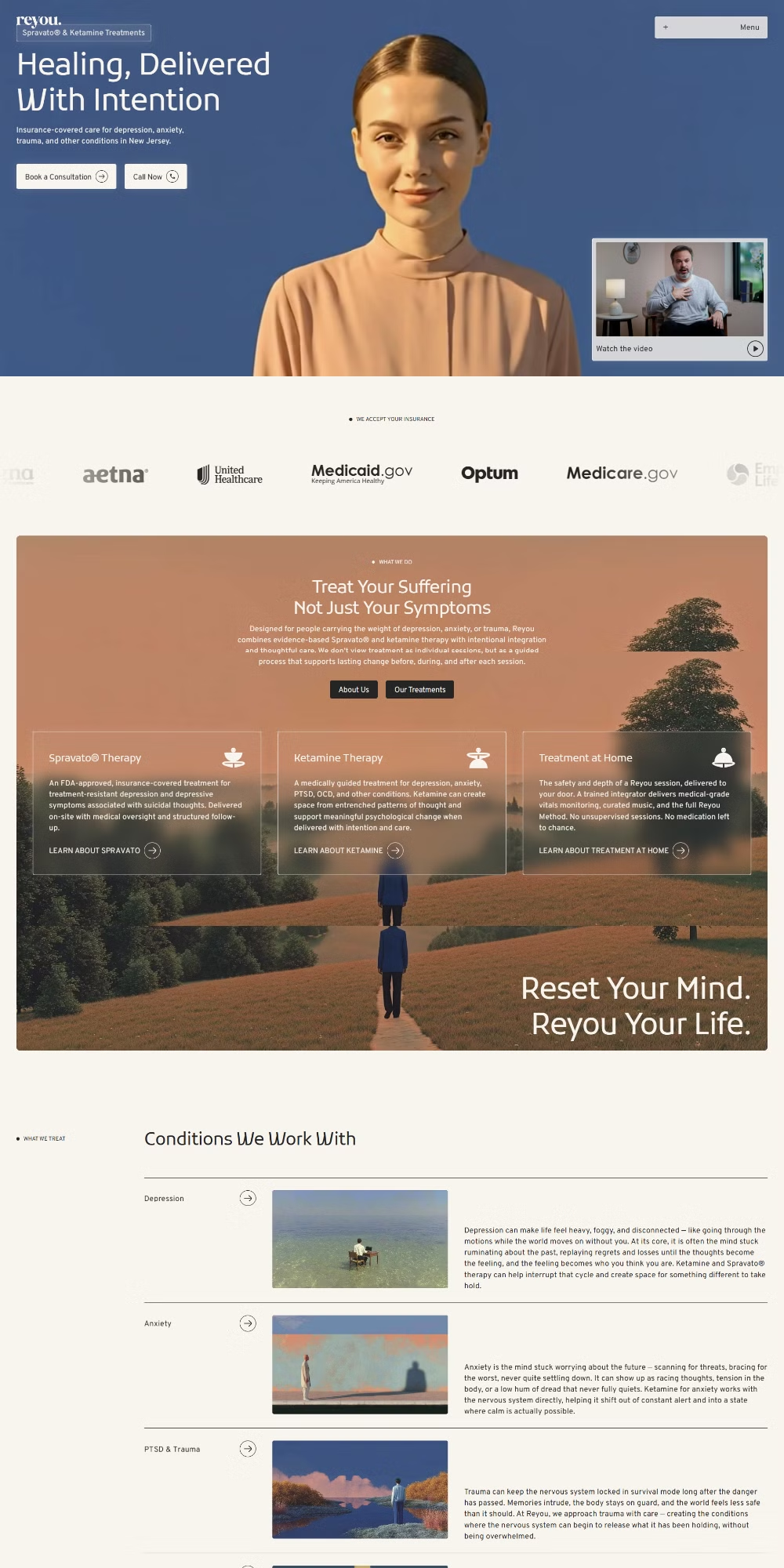
Platform: Webflow
What Makes It Good: One of the more polished sites on this list from a UX standpoint. The micro-interactions are throughout and they genuinely elevate the experience. Entrance animations are smooth without being showy. The imagery is strong and the CTAs are easy to find. This is a site where the design and the content are working together rather than competing.
Live Link: reyou.life
The micro-interaction question
ReYou and Downtown Somatic both use micro-interactions well. These are the small animations that happen when you hover over a button or scroll past a section. Done right, they make a site feel polished and alive. Done badly, they slow the site down and distract visitors. The rule of thumb is simple: if the animation draws attention to itself, it’s doing too much.
15. DC Talk Therapy
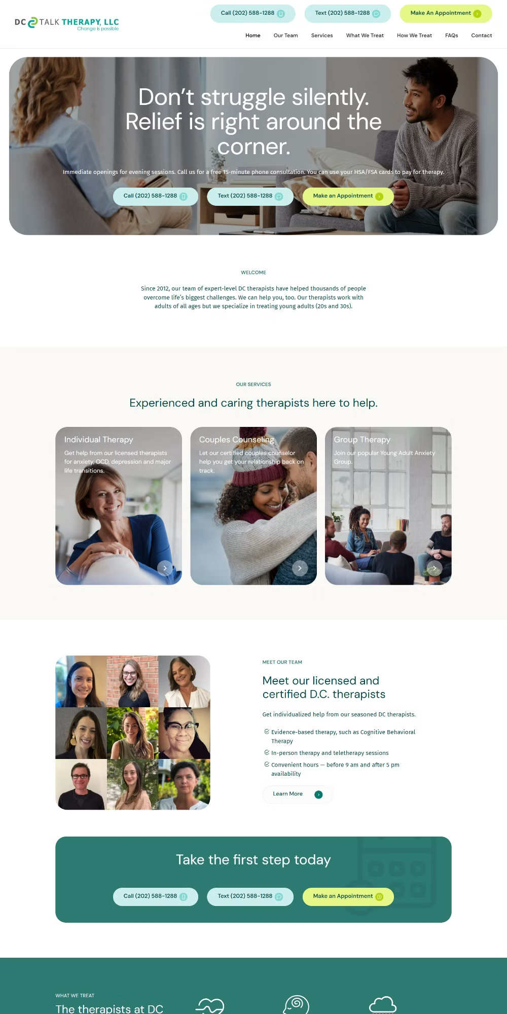
Platform: WordPress
What Makes It Good: Solid color choice and a clear, no-fuss structure. The design doesn’t overreach. It communicates what the practice does and makes it easy to take the next step. Sometimes the most effective website design examples are the ones that execute the basics really well without trying to be clever about it.
Live Link: dctalktherapy.com
16. Vital Therapy DC
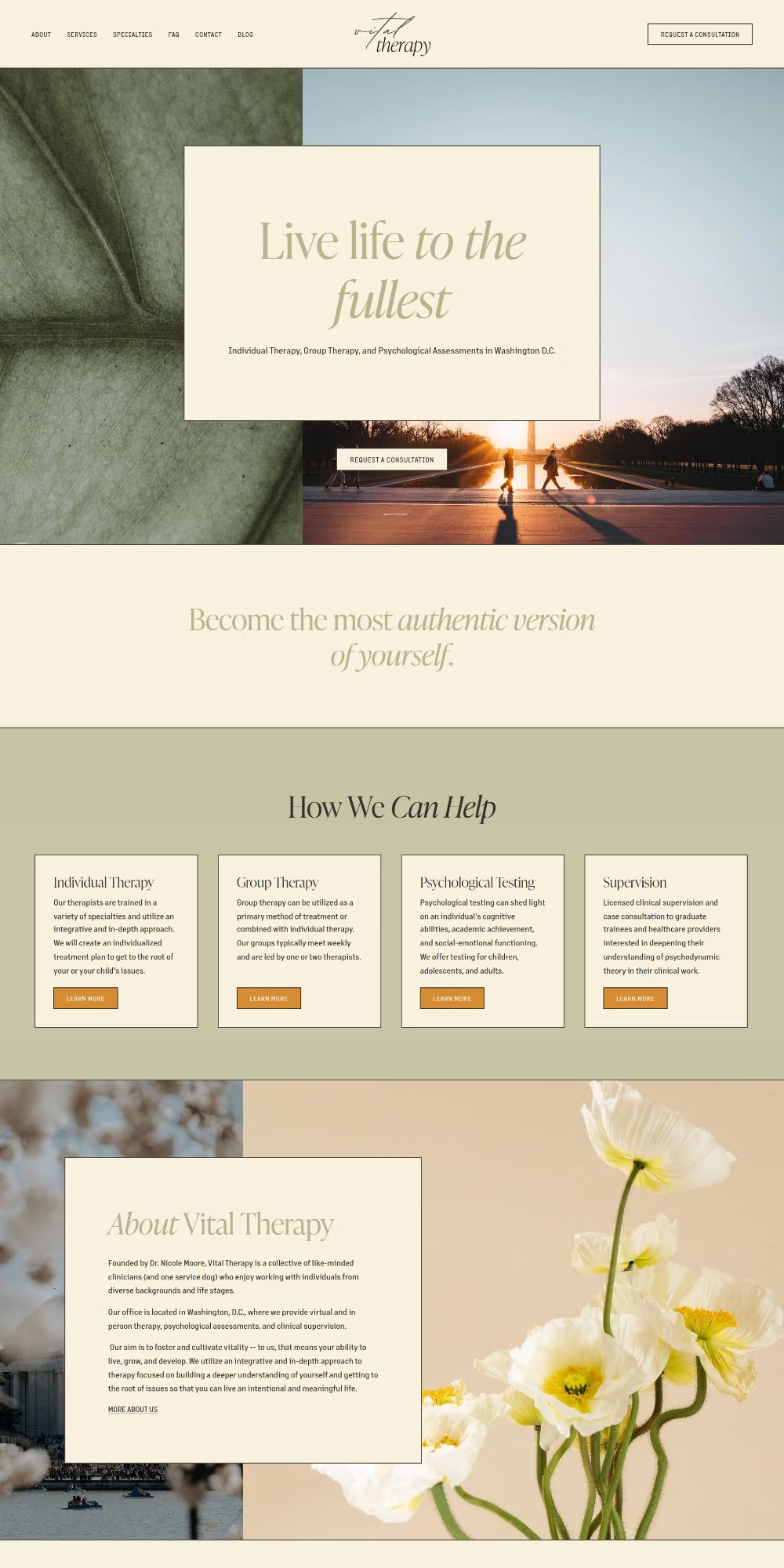
Platform: Squarespace
What Makes It Good: Minimalism done properly. The serif headings give it authority and the pastel palette keeps things warm. The CTAs are clear and the structure is easy to follow from top to bottom. There’s no section that makes you pause and wonder what it’s trying to say. That clarity is harder to achieve than it looks.
Live Link: vitaltherapydc.com
17. The Peak Therapy
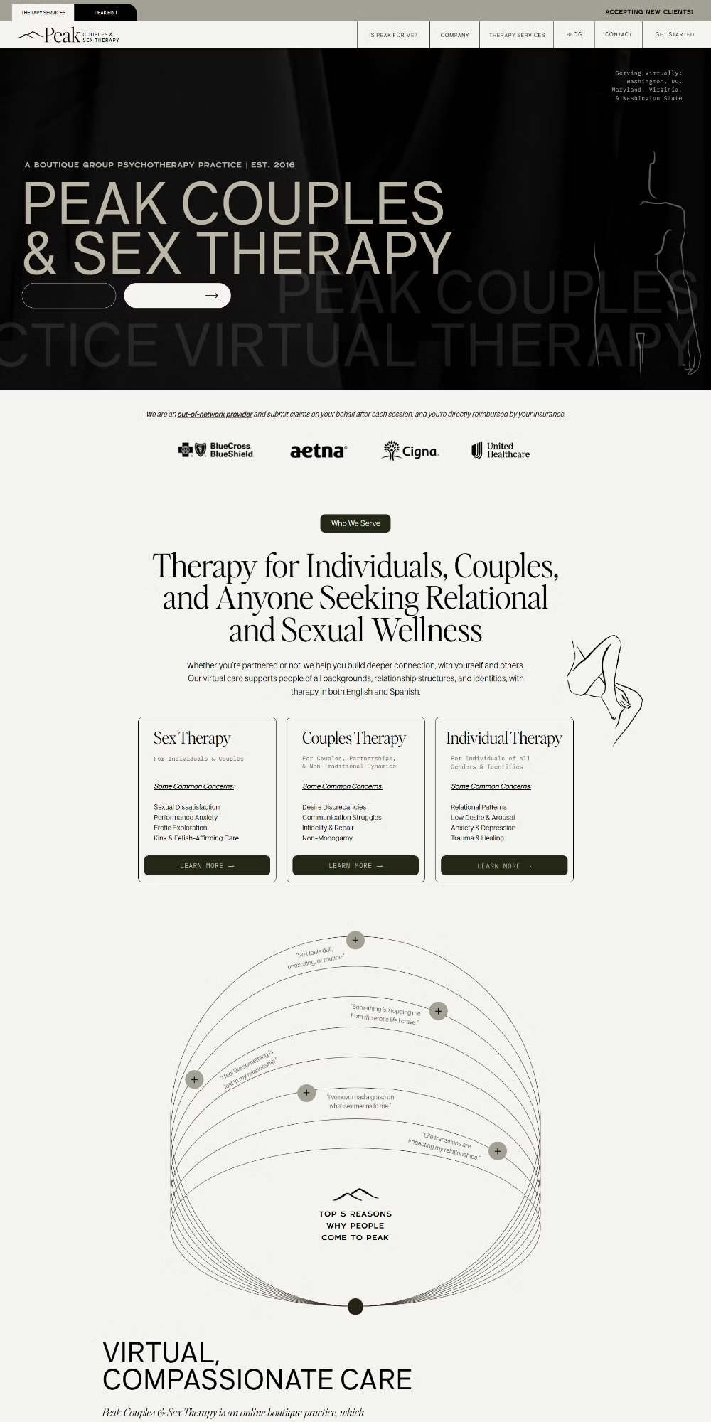
Platform: Showit
What Makes It Good: Illustrations, serif headings, pastel palettes, minimal layout. All the right elements, and they’re combined really well here. The animated elements add energy without clutter and the CTAs are prominent. This site has a clear sense of its own identity from the first scroll, which is one of the harder things to get right in this category.
Live Link: thepeaktherapy.com
18. Unwind Wellness
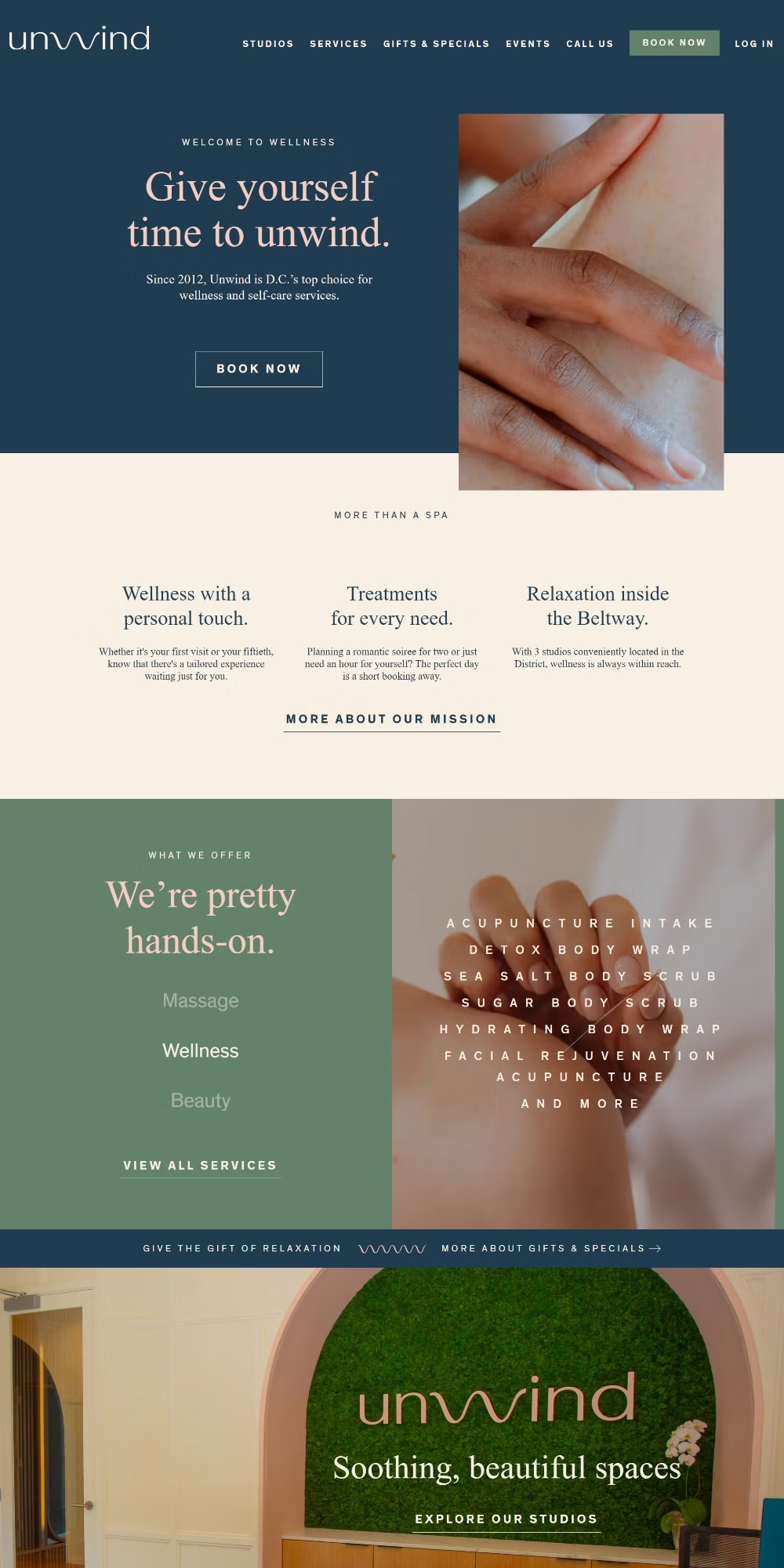
Platform: Custom Coded
What Makes It Good: Clean, calm, and confident. Serif headings, pastel palette, clear structure, minimal distractions. The CTAs are easy to find and the copy doesn’t overstay its welcome. It’s a strong example of modern website design that understands its audience. Someone looking for a therapist wants to feel at ease before they’ve even read a word, and this site delivers that.
Live Link: unwindwellness.com
What to Take Away From This
A few things show up again and again across the best website designs on this list. Serif fonts build trust in ways sans-serifs often don’t in healthcare contexts. Soft, considered color palettes communicate safety and calm before the copy even does. And clear structure, meaning a logical path from headline to CTA, is what turns a good-looking site into one that actually converts visitors into clients.
You don’t need the most visually complex site. You need one that makes the right person feel like they’re in the right place. That’s what professional website design comes down to in a category like therapy.
If your current site isn’t doing that, the examples here are a good benchmark. Pick two or three that match the feeling you’re going for and use them as a reference when talking to a designer or building something yourself.
And if you need help designing or building a therapy website, get in touch. It’s what I do.