There’s a version of most designer portfolios where the design is doing all the work and the actual projects are somewhere at the bottom. You scroll past the animated hero, the custom cursor, the full-bleed video, and by the time you get to the case studies you’ve already lost the thread.
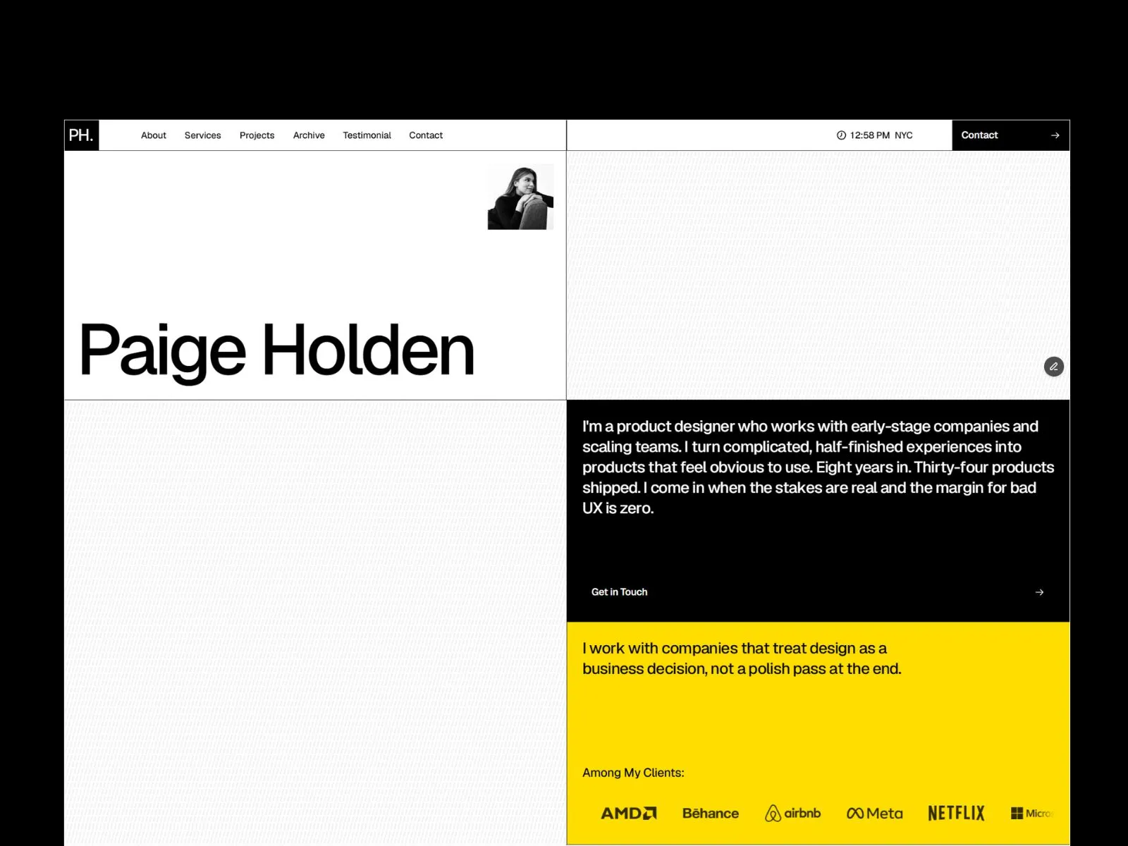
Paige Holden is a Framer portfolio template that goes the other way. Minimal grid layout, editorial case study pages, strong typography. The design stays out of the way so whoever’s looking actually gets to the work.
What’s in it
The homepage has everything a portfolio needs to keep someone reading: an intro, selected work, services, experience, a metrics section, testimonials, and a contact CTA. Not because that’s a template default. Because that’s the order someone’s brain moves through when they’re deciding whether to reach out.
Each project gets its own case study page through the Framer CMS. Not a lightbox. Not a gallery. A full page with room to walk through what the problem was, what you did, and what came out of it. You can add as many projects as you want, and none of it touches the layout.
There’s also a legal CMS for privacy policy and terms. Boring but necessary, and at least you can update it without fighting the design.
Who it’s actually for
Freelance designers. Product designers. UX/UI people. Creative directors who want something credible to send a client. Small studios that need one clean page and not a full site build.
It’s not for photographers, developers, or anyone who needs pricing tables or a booking system. That’s a different kind of project.
Setting it up
No code. You’re in Framer’s visual editor, you swap in your name and projects, and you adjust colors and type to match your brand. Adding a case study is filling out a form in the CMS. That’s the whole process.
If you need more later, Framer handles it. Connect a contact form, add analytics, pull in testimonials. The template gives you something solid to start from.
Why it looks the way it does
Most portfolio templates either go so minimal that nothing holds your attention, or they try so hard that the design becomes the portfolio. Paige Holden lands somewhere useful.
The grid is clean. The type is strong. The case study pages are built around the idea that showing your process matters more than showing your finals. Whitespace is generous. Nothing is fighting for attention except the work.
Hiring managers and clients spend maybe 30 seconds on a portfolio before they decide whether to keep reading. The template is built around that reality.