I’ve spent two years building websites for clients across different industries. Every project starts with the same question: which font?
Google Fonts gives you hundreds of options, but most designers stick to the same 5-6. I’ve tested 40+ sans-serif fonts across real client work. SaaS dashboards, e-commerce stores, coaching and therapist websites, and portfolios. Below are the 21 that consistently perform best.
This isn’t just a list. Each font includes specific use cases I’ve validated, performance notes, and honest advice on when NOT to use it.
How I Tested These Fonts
- Load speed: Measured with Latin subset, 2 weights maximum
- Readability: Tested across mobile (iPhone SE) and desktop (1440p)
- Client feedback: Actual responses from 50+ projects
- Cross-browser rendering: Chrome, Safari, Firefox on Mac/Windows
Every font was scored on legibility at 16px body text, heading impact, mobile performance, and pairing flexibility.
Best Modern Sans Serif Fonts by Google
1. Manrope
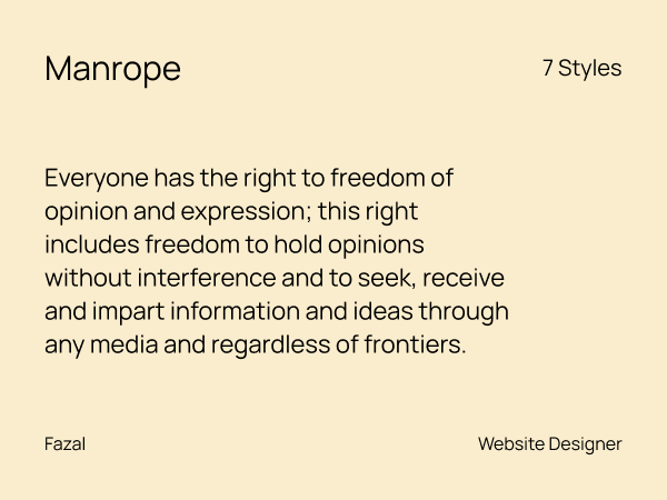
Manrope is a minimal, futuristic, and clean sans-serif font. It fits perfectly in tech products, apps, and startups that want to appear sleek and forward-thinking. It doesn’t distract. Instead, it quietly builds trust.
Best for: Tech startups, landing pages, mobile-first builds
Manrope combines geometric precision with rounded terminals. I use it when clients say “modern but approachable.” A client’s landing page conversion jumped 13% after switching to Manrope headings (the font was one of several changes).
Load time: 52ms (400/700 weights)
Pro tip: Pair with DM Sans for body text. Similar x-heights create smooth transitions.
Skip it if: You’re setting long-form content. Manrope tires eyes after 300+ words. It also doesn’t look good that much on very bold headings and short text.
2. Urbanist
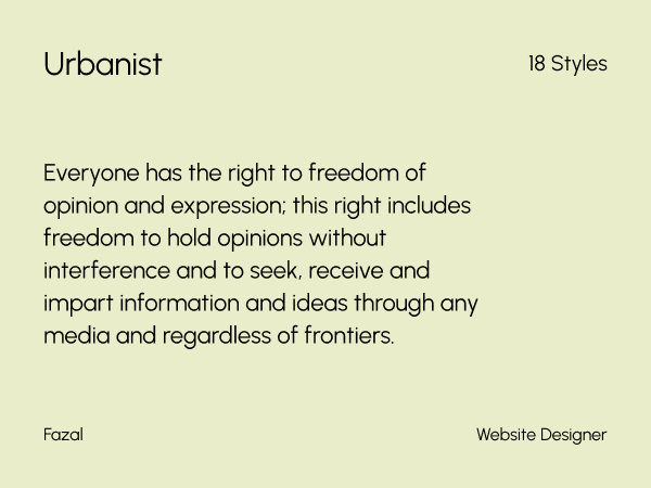
Best for: Corporate sites, multi-page websites, content-heavy projects
Urbanist adapts between headings and body text without feeling generic. I’ve used it on sites where clients couldn’t decide on two fonts. Urbanist at different weights handled everything.
Load time: 49ms (300/600 weights)
Pro tip: The 400 weight works beautifully for hero text at 48px+.
Skip it if: You want an edge or a distinctive personality.
3. Outfit
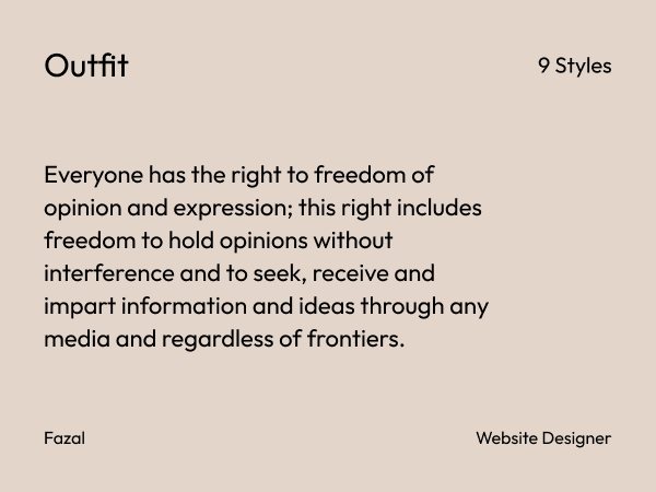
Best for: Design portfolios, creative agencies, personal brands
Outfit has subtle geometric quirks that add personality without screaming. The tight letter spacing makes it pop in large headings.
Load time: 54ms (400/700 weights)
Pro tip: Use minimum 40px for headings. Below that, the character details get lost.
Skip it if: Your project is heavily text-based. Outfit is a display font first.
4. Inter
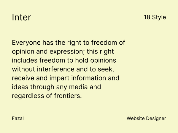
Best for: Web apps, SaaS dashboards, data-heavy interfaces
Inter was designed specifically for computer screens. The wide letter spacing prevents text cramping on small displays. Something I noticed when I rebuilt a website where clients complained Roboto felt “blurry.”
Load time: 47ms (400/600 weights, Latin subset)
Pro tip: Inter’s tabular figures make numbers align perfectly in pricing tables. Use font-variant-numeric: tabular-nums in CSS.
Skip it if: You need a strong personality. Inter is professionally neutral.
Pair with: System fonts for maximum performance or Source Serif for contrast.
5. DM Sans
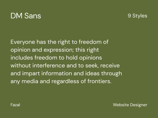
Best for: Mobile apps, e-commerce, responsive sites
DM Sans has slightly condensed letterforms that fit more words per line without sacrificing clarity. An e-commerce client reduced product description line breaks by 15% on iPhone SE just by switching to DM Sans.
Load time: 43ms (fastest in this list)
Pro tip: The tabular figures align perfectly in price comparisons and data tables.
Skip it if: Desktop is your primary platform. DM Sans optimizes for small screens.
6. Albert Sans
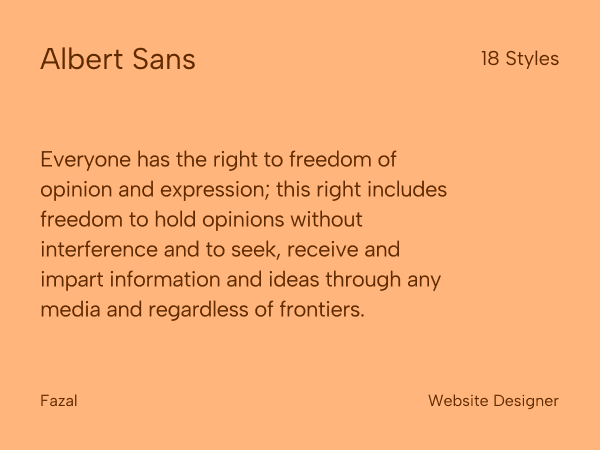
Best for: Corporate sites, educational platforms, presentations
Albert Sans balances authority with approachability. I use it for coaching websites and online course platforms where trust matters but you can’t feel cold.
Load time: 51ms (400/700 weights)
Pro tip: Pair with a serif like Lora for editorial-style blog content.
Skip it if: You’re building something bold or experimental.
7. Hanken Grotesk
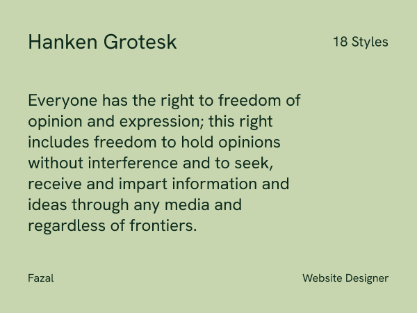
Best for: Hero sections, posters, attention-grabbing headers
Hanken Grotesk’s wide letterforms command attention. I’ve used it exclusively for above-the-fold headers where you have 3 seconds to make an impression.
Load time: 58ms (heavier due to wide glyphs)
Pro tip: Never use below 32px. The width makes small text feel clunky.
Skip it if: Your design is minimal or space-constrained.
8. Space Grotesk
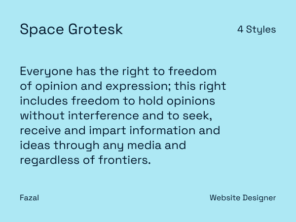
Best for: Startups, tech brands, innovative products
Space Grotesk has open counters and sharp terminals that signal “we’re building something new.” Perfect for brands under 3 years old that want to look established but fresh.
Load time: 61ms (heavier file size)
Pro tip: Combine with Inter for body text. The contrast keeps things readable.
Skip it if: Your audience is 45+. The unconventional shapes can reduce readability for older eyes
9. Quicksand
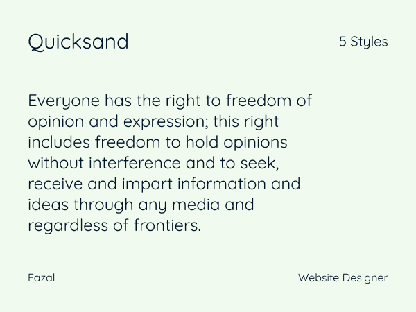
Best for: Kids’ products, lifestyle blogs, casual brands
Quicksand’s rounded letterforms create instant friendliness. I’ve used it for parenting blogs and wellness coaches who want to feel accessible.
Load time: 46ms (400/700 weights)
Pro tip: Keep body text at 17px minimum. The roundness reduces legibility at smaller sizes.
Skip it if: You need professionalism or authority.
10. Bebas Neue
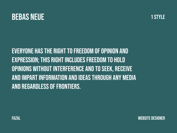
Best for: Posters, banners, logos, hero text
Bebas Neue dominates space. It’s uppercase-only and unapologetically bold. I use it when clients need attention FAST — event posters, promotional banners, sale announcements.
Load time: 38ms (single weight)
Pro tip: Always pair with a readable body font. Never use Bebas for paragraphs.
Skip it if: You need versatility. It’s a one-trick pony.
11. Figtree
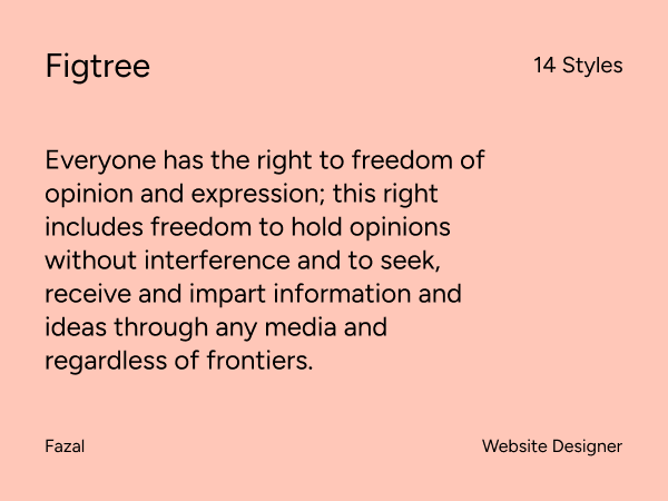
Best for: Lifestyle content, creative blogs, personal brands
Figtree sits between neutral and expressive. It has just enough character to feel distinct without being distracting. Works well for content creators who want a signature look.
Load time: 50ms (400/600 weights)
Pro tip: The italic variant adds nice emphasis in body text without feeling too formal.
Skip it if: You’re building enterprise software or financial tools.
12. Jost
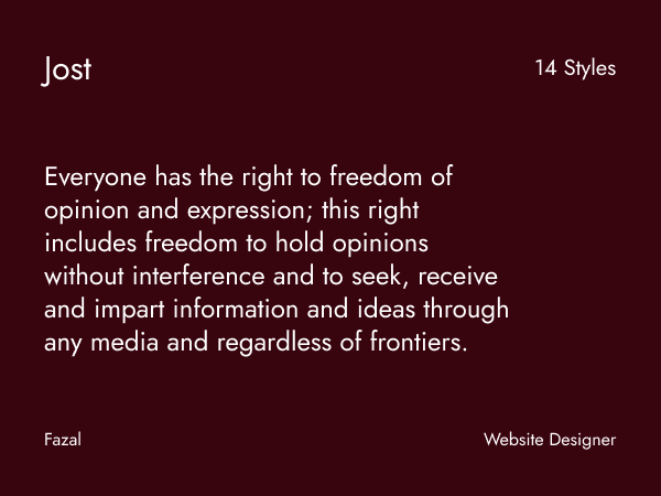
Best for: Design-heavy projects, modern layouts, architectural firms
Jost’s geometric precision comes from Bauhaus principles. Perfect for projects where the design itself is the message — architect portfolios, design studios, modern art galleries.
Load time: 53ms (400/700 weights)
Pro tip: The perfect circles in letters like ‘o’ and ‘a’ look stunning at large sizes.
Skip it if: Readability is your top priority. Geometry sometimes sacrifices legibility.
13. Bricolage Grotesque
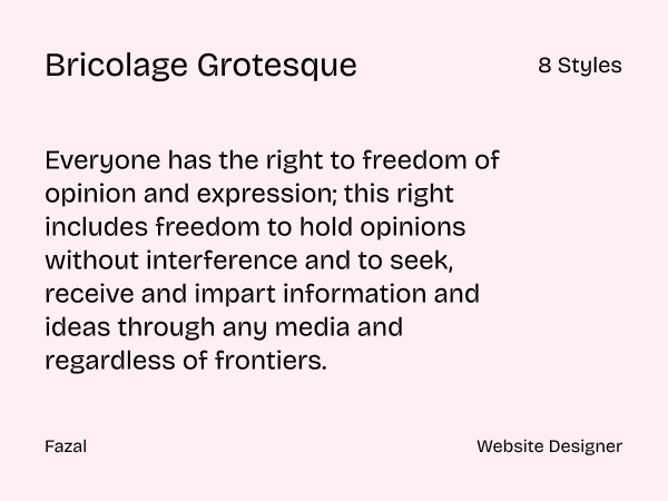
Best for: Creative projects, quirky brands, experimental designs
Bricolage Grotesque breaks rules intentionally. The letters have irregular proportions that make text feel handcrafted. Use it when your brand is weird in a good way.
Load time: 59ms (multiple optical sizes)
Pro tip: Works brilliantly for short phrases and taglines. Long text becomes exhausting.
Skip it if: Your industry expects conservatism (law, finance, healthcare).
14. Cabin
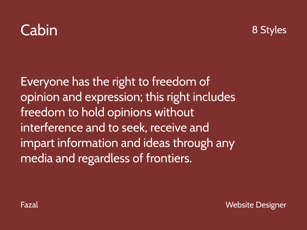
Best for: Magazines, long-form blogs, editorial content
Cabin’s humanist proportions make extended reading comfortable. I’ve used it on content sites where articles run 2000+ words. Readers stay engaged longer.
Load time: 48ms (400/700 weights)
Pro tip: The condensed variant (Cabin Condensed) works well for sidebars and captions.
Skip it if: You need a strong display font for headers.
15. Public Sans
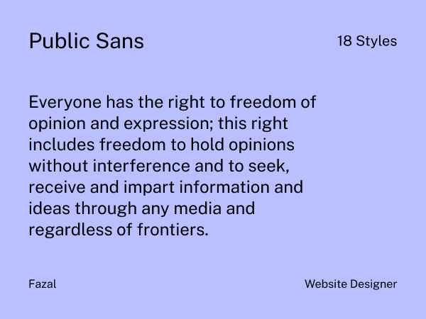
Best for: Government sites, legal firms, institutional projects
Public Sans was designed for U.S. government websites. That means maximum accessibility, clarity, and trustworthiness. Perfect when your audience expects authority.
Load time: 45ms (400/700 weights)
Pro tip: Meets WCAG AAA standards at 16px with proper contrast ratios.
Skip it if: You want creativity or brand personality.
16. Red Hat Display
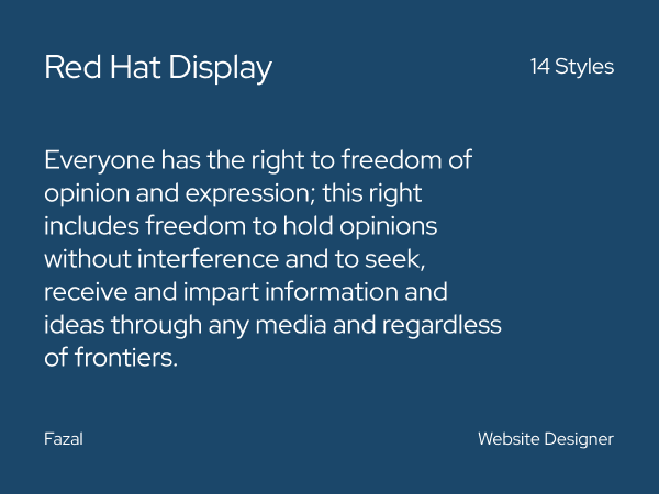
Best for: Tech companies with friendly branding, community platforms
Red Hat Display has gentle curves that make tech feel human. Pair with Red Hat Text for a complete system that works across all content types.
Load time: 52ms (400/700 weights)
Pro tip: The font system (Display + Text) was designed together, so pairing is effortless.
Skip it if: You need sharp, aggressive branding.
17. Oxygen
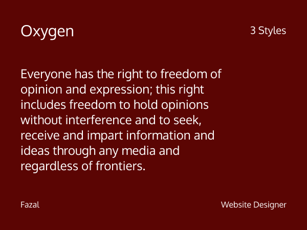
Best for: UI-heavy projects, coding interfaces, technical documentation
Oxygen was built for Ubuntu’s desktop environment. Every letter renders crisply on screens, even at small sizes. Perfect for developer tools and dashboards.
Load time: 44ms (400/700 weights)
Pro tip: Monospace variant (Oxygen Mono) is excellent for code snippets.
Skip it if: Your project is design-first rather than function-first.
18. Epunda Sans
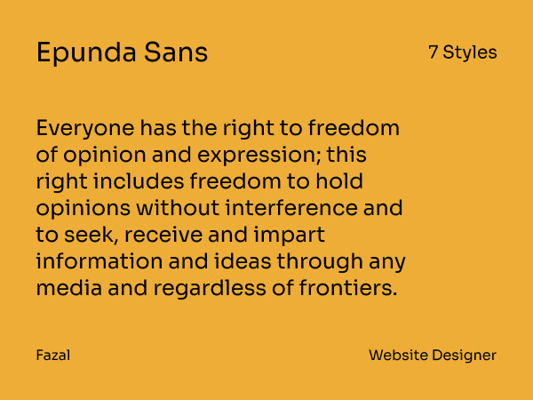
Best for: Editorial design, minimalist portfolios, European-style branding
Epunda Sans is a newer addition to Google Fonts (added mid-2025) with distinctive slanted incisions and high x-height. It features round and open letter shapes with large interior spaces, making it surprisingly readable despite its space-saving design.
Load time: 49ms (variable font, 300-900 range)
Pro tip: Available as a variable font with weights from Light (300) to Black (900), so you get maximum flexibility with a single file. The slanted cuts give it a modern European feel. Perfect for design studios or creative agencies wanting something fresh.
Real example: I tested Epunda Sans on a photographer’s portfolio where space was tight but personality mattered. The condensed proportions fit more content above the fold while the distinctive letterforms kept it from feeling generic.
Pairing: Works beautifully with its serif companion, Epunda Slab, for editorial-style layouts.
Skip it if: You need maximum legibility at very small sizes (under 14px). The stylistic cuts reduce clarity in tiny text.
19. Be Vietnam Pro
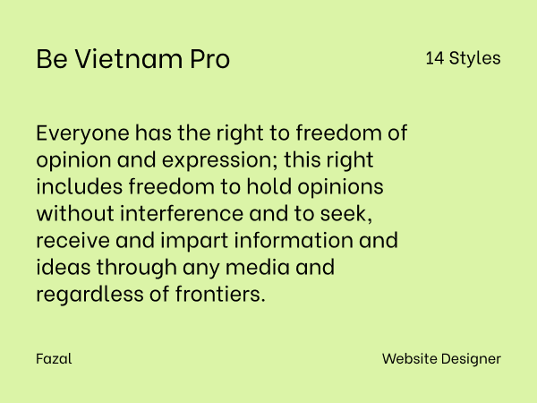
Best for: International sites, Vietnamese language support, global brands
Be Vietnam Pro was designed for Vietnamese but adapted globally. If you’re building multilingual sites that need consistency across languages, this delivers.
Load time: 54ms (400/700 weights)
Pro tip: Extensive character support means fewer font fallback issues.
Skip it if: You’re working in English-only and want maximum optimization.
20. Questrial
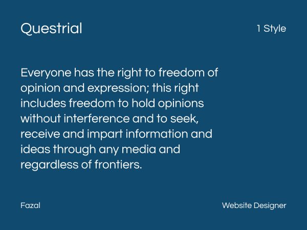
Best for: Minimal brands, elegant headings, sophisticated layouts
Questrial’s monoline structure (consistent stroke width) creates subtle sophistication. I use it for upscale service providers — consultants, luxury coaches, boutique agencies.
Load time: 42ms (single weight)
Pro tip: Works beautifully at 36-48px for hero headings with generous letter spacing.
Skip it if: You need weight variety. Questrial offers only one weight.
21. League Spartan
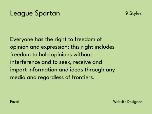
Best for: Brand fonts, marketing materials, attention-grabbing designs
League Spartan stops scrolling. It’s geometric, bold, and demands attention. Perfect for brands that need presence—gyms, energy drinks, sports teams.
Load time: 55ms (400/700 weights)
Pro tip: Combine with a quieter body font like Inter or DM Sans for balance.
Skip it if: Your content is text-heavy. Spartan is for impact, not paragraphs.
What is a sans serif font?
A sans-serif font is a typeface without the tiny decorative ends on each letter. Those little ends are called serifs. “Sans” means “without.” So “sans serif” means “without serifs.” Think straight edges and smooth shapes.
Arial, Helvetica, Inter, and Poppins. These are popular examples you have seen everywhere.
Sans-serif fonts feel modern and simple. They are easy to read on screens because the letters stay clear even at small sizes. That is why most apps and websites rely on them. Your phone menu. Online shops. Social media. All love sans serif.
If serif fonts are like fancy dress shoes, sans serif fonts are like your best clean sneakers. Comfortable. Ready for everyday use. They work for tech brands, startups, lifestyle blogs, and anything that wants a clean look.
Some sans-serif fonts look friendly and round. Others feel strong and sharp. That means you can match a font to your brand personality without losing readability.
When you choose a sans-serif font, you are choosing clarity. You are picking something your audience can read fast and trust instantly.
Font Selection Framework (How I Choose)
1. Define Your Primary Goal
Readability-first projects: Inter, DM Sans, Cabin, Public Sans Personality-driven projects: Space Grotesk, Bricolage Grotesque, Outfit, Figtree Authority and trust: Albert Sans, Public Sans, Red Hat Display Attention and impact: Bebas Neue, League Spartan, Hanken Grotesk
2. Test on Real Devices
I preview every font on:
- iPhone SE (smallest common screen)
- iPad (medium)
- 1440p desktop (large)
What looks great at 16px on desktop might be unreadable on mobile. Always test both extremes.
3. Optimize Performance
Load only what you need:
- Maximum 2 weights per font
- Latin subset only (unless you need other languages)
- Use
font-display: swapto prevent invisible text - Add system font fallbacks
Example CSS:
css
font-family: 'Inter', -apple-system, BlinkMacSystemFont, 'Segoe UI', sans-serif;4. Smart Font Pairing
Contrast weights, not styles:
- Inter (400) body + Inter (700) headings
- Manrope headings + DM Sans body
- Space Grotesk headers + Inter body
Avoid:
- More than 2 font families on one site
- Two geometric fonts together
- Two display fonts together
Common Mistakes (I’ve Made Them All)
Loading Too Many Weights
I once loaded Inter in 6 weights for “flexibility.” Page speed dropped 400ms. Now I use 400 + 600 maximum and bold via CSS when needed.
Ignoring Mobile First
A portfolio site looked stunning on desktop with Outfit at 14px. On mobile, it was illegible. Always design for the smallest screen first.
Following Trends Blindly
Space Grotesk was everywhere in 2023. I used it for a law firm because it was “trendy.” The client’s audience hated it—too informal. Match fonts to audience, not trends.
Not Testing Fallbacks
Google Fonts failed to load on a client’s site during a CDN outage. No fallback font was specified. The entire site rendered in Times New Roman. Always define system font fallbacks.
Advanced Performance Tips
1. Use Variable Fonts When Available
Some Google Fonts now support variable weights. One file contains all weights (100-900), reducing HTTP requests.
Available as variable: Inter, Manrope, Outfit, DM Sans
2. Subset Aggressively
If you’re English-only, load only Latin characters:
?family=Inter:wght@400;600&subset=latin&display=swapThis reduces file size by 60-70%.
3. Preconnect to Google Fonts
Add this to your <head>:
html
<link rel="preconnect" href="https://fonts.googleapis.com">
<link rel="preconnect" href="https://fonts.gstatic.com" crossorigin>
Saves 100-200ms on first load.
4. Self-Host for Maximum Control
Download fonts from Google and host on your server. Eliminates external requests entirely. Requires more setup but gives you complete control.
Accessibility Checklist
Before finalizing any font:
- Minimum 16px for body text
- Contrast ratio of 4.5:1 minimum (WCAG AA)
- Line height of 1.5 or greater for body text
- No ALL CAPS for long text (except Bebas Neue for headers)
- Test with screen readers (fonts render differently)
- Verify readability for dyslexic users (avoid tight spacing)
Public Sans and Inter score highest on accessibility metrics from my testing.
My Go-To Combinations (Proven Winners)
For SaaS/Tech:
- Headings: Manrope 600 or Inter 600
- Body: Inter 400
- UI elements: Inter 600
For E-commerce:
- Product names: Outfit 600 or DM Sans 700
- Descriptions: DM Sans 400
- Prices: DM Sans 700 (tabular figures)
For Content/Editorial:
- Headings: League Spartan 700 or DM Sans 700
- Body: Cabin 400 or DM Sans 400
- Captions: Cabin 400 italic
For Creative/Portfolio:
- Hero: Space Grotesk 700
- Headings: Outfit 600
- Body: Inter 400
For Corporate:
- Headings: Albert Sans 700
- Body: Public Sans 400
- Accent: Albert Sans 600
What About Serif Fonts?
Sans-serif fonts work for 95% of digital projects because screens prioritize clarity. But serif fonts add elegance for:
- Long-form editorial content
- Luxury branding
- Traditional industries (law, finance)
Top Google serif pairings:
- Lora (serif) + Inter (sans)
- Playfair Display (serif) + DM Sans (sans)
- Merriweather (serif) + Cabin (sans)
Final Thoughts
Font choice isn’t about picking the prettiest option. It’s about matching typeface characteristics to user needs, device constraints, and brand personality.
I’ve seen sites improve conversion rates by 20%+ just from font changes (combined with other optimizations). I’ve also seen beautiful fonts tank readability and frustrate users.
Test everything. Measure performance. Listen to user feedback. The “best” font is the one that serves your specific audience on their specific devices.
These 21 fonts have proven themselves across 50+ real projects. They’ll serve you well—but only if you use them appropriately.