Most life coach websites I see look nice enough. Clean fonts, calm colors, maybe a logo that cost a few hundred bucks. The problem is that they don’t bring in clients. They sit there like a digital business card, waiting for someone to be impressed enough to reach out. That almost never works.
Design quality for a coaching website isn’t about beauty. It’s about whether a person lands on your page and within five seconds knows what you do, who it’s for, and what to do next. When I audit a coach’s site, I’m looking for clarity, speed, and trust signals. The visual polish matters only after those three are in place.
Here’s how to actually improve the quality of your life coach website design, not just make it prettier.
Start with a clear promise, not a fuzzy mission statement
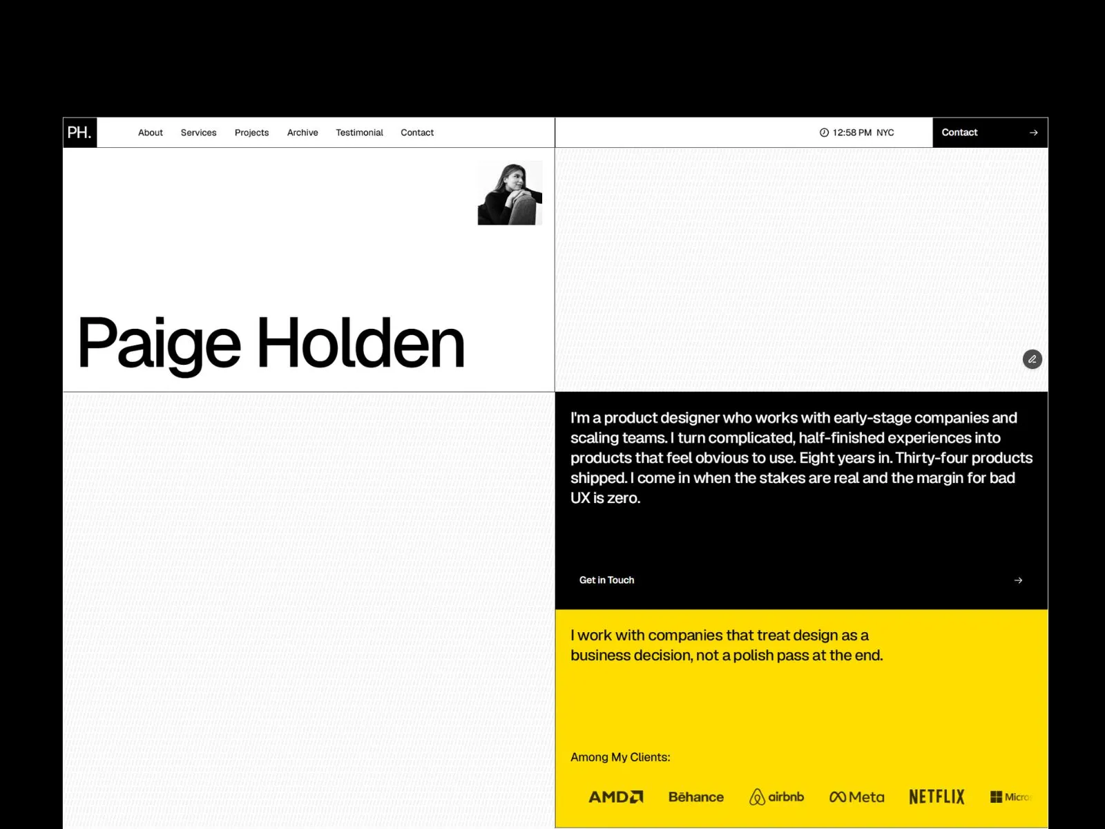
Your hero section (the first screen people see) needs to say who you help and what the outcome is. Not “Empowering transformation” or “Living your best life.” Those are too vague. A strong headline like “I help new fathers build a career they don’t want to escape from” tells a specific person that this site is for them.
Specificity filters out the wrong people and pulls in the right ones. That improves your conversion rate immediately, and it’s the single most impactful design change you can make. After the headline, a short subhead and a button that says “Book a free discovery call” are all you need. No carousels, no videos, no walls of text.
Cut the design clutter
Extra visual elements don’t make a site look higher quality. They make it look busy. I’ve seen coaching sites with animated icons, parallax scrolling, and three different calls to action on the same screen. The visitor gets overwhelmed and leaves.
Stick to a single column layout on mobile, lots of white space, and one clear goal per page. If you want them to book a call, don’t also ask them to download a freebie and follow you on Instagram in the same section. Kill the distractions. White space is one of the most underrated tools for improving website design quality. It tells the eye where to go.
Make the next step impossible to miss
Too many coaching websites hide the “Contact” button. It’s a small text link in the navigation or blended into the footer. If I have to hunt for a way to talk to you, I won’t bother.
Put a bright, contrasting button somewhere in the top right of your header and repeat it after every important section on the page. Use a direct phrase like “Schedule a call” or “Let’s talk” instead of “Learn more.” And on the contact page, ask for an email address and maybe a name. That’s it. Long forms kill lead generation for life coaches.
Real photos beat stock photos every time
Stock photography is a trust killer. People know the difference between a real coach sitting at her desk and a model smiling at a laptop she’s never used. If you want your life coach website design to build credibility, use real photos of yourself. Show your workspace, your face, maybe a shot of you working with a client (with permission). Authentic images make a visitor feel like they already know you a little. That small comfort makes them more likely to reach out.
Your site’s speed matters more than you think
A sluggish website sends a message: you don’t care about details. If your pages take longer than three seconds to load on a phone, many visitors will bounce before they see your headline. Google uses page speed as a ranking factor too. So a slow site hurts both user experience and SEO for life coaches.
Most slow sites are caused by oversized images, too many plugins, or cheap hosting. Compress your images, use a fast host, and remove any scripts you don’t absolutely need. I’ve seen bounce rates drop by over 30% just from cleaning up a site’s backend. That’s a design quality improvement that pays for itself.
Build for mobile, not just desktop
The majority of people searching for a coach will do it on their phone. If your site looks great on a 27-inch monitor but the text is tiny and the button requires a surgeon’s thumb, you’re losing business. Test every page on a real phone. Make sure fonts are readable without zooming, buttons are at least 44 pixels tall, and forms are easy to fill with one hand. Mobile responsive design isn’t a bonus; it’s the baseline.
Simple SEO can bring you consistent leads
A well-designed site that nobody can find is a waste. You don’t need to become an SEO expert, but do the basics right. Include your city and coaching specialty in your page title and headings. For example, “Life Coach for Divorced Moms in Denver” is far better than “Jane Smith Coaching.” Write a service page for each niche you serve. Fill in your meta descriptions with human-readable sentences, not keyword spam.
These small on-page SEO tweaks boost your life coach website design quality from both a user and a search engine perspective. They help you show up when someone types exactly what you offer into Google.
Templates often do more harm than good
Many coaches grab a cheap website template because it looks polished in the demo. Then they spend months fighting it. Templates come loaded with features you’ll never use, bloated code, and design choices that don’t match the calm, trustworthy feel a coach needs. The result is a site that looks generic and performs poorly.
A custom design, or at least a focused theme built specifically for coaches, will always outperform a multipurpose template. You get a unique look, faster load times, and a layout that actually guides visitors toward booking a call. If you’re serious about improving your website design quality, step away from the $39 do-it-all templates.
When to get help with your coaching website design
If you’ve read this far and feel a knot in your stomach because your site does none of the above, that’s okay. Most coaches aren’t designers, and they shouldn’t have to be. I build coaching websites for a living. I focus on clean, fast sites that make your offer obvious and get people to reach out. No stock photo of a handshake in sight.
You can keep tweaking your template and hoping for the best, or you can get a site that does the job while you sleep. If you want help, I’m around. I design life coach websites that are simple and effective and feel like you, not a generic corporate page. Reach out when you’re ready to stop fighting your website and start using it.