I’ve tested 30+ serif fonts from Google across several client websites in the past years. Some delivered exactly what their specimens promised. Others looked beautiful in mockups but frustrated actual users.
This guide covers the 12 serif fonts that consistently performed best in real projects, with load times, honest limitations, and proven pairing recommendations.
What Are Serif Fonts?
Serif fonts feature small decorative marks called serifs at the ends of their letter strokes. But modern serif fonts don’t just copy old styles. Instead, they adapt serifs to contemporary needs:
- They have cleaner, sharper lines than traditional serifs.
- A balanced contrast between thick and thin strokes creates clarity.
- Open letterforms and larger x-heights improve readability on screens.
- They offer subtle flair without overwhelming the design.
This blend of tradition and modernity makes modern serif fonts a top choice for digital projects in 2026. They convey professionalism, warmth, and approachability all at once.
What Makes a Serif Font “Modern”?
Traditional serif fonts were designed for print. Modern serif fonts adapt those classical forms for digital screens while maintaining their elegance.
Key differences:
Larger x-heights: The height of lowercase letters like ‘x’ and ‘a’ is proportionally bigger, improving legibility at small screen sizes.
Open counters: The interior spaces of letters (the hole in ‘e’ or ‘a’) are wider, preventing them from filling in on lower-resolution displays.
Balanced contrast: Modern serifs reduce the extreme difference between thick and thin strokes that worked in print but cause issues on screens.
Optimized spacing: Letter spacing and word spacing are adjusted for pixel rendering rather than ink on paper.
High-resolution displays (Retina, 4K) can now render the fine details that were previously illegible, making sophisticated serif typography viable for web design in 2026.
Best Modern Serif Google Fonts for 2026
Here are the top best serif Google fonts for 2026 (according to my opinion), all free and screen-optimized for your use:
1. Instrument Serif
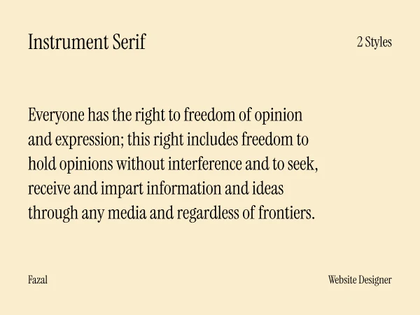
Designer: Rodrigo Fuenzalida, Jordan Egstad
Load time: 95ms
Best for: Fashion editorials, art galleries, high-impact hero sections
Instrument Serif features dramatic condensed proportions and high stroke contrast designed for large display sizes. The bold letterforms command attention in ways traditional serifs never attempt.
I’ve used it on creative portfolios and therapist websites where stopping visitors in their tracks mattered more than gentle readability. At 64px+ in hero sections, it creates undeniable visual impact.
Critical limitation: This is a display-only font. One client insisted on using it for 16px navigation menus despite my warnings. The condensed letterforms became completely illegible. Never use below 40px.
Technical specs:
- Available weights: Regular, Italic only
- Variable font: No
- Character set: Latin basic
Best practices: minimum 48px, optimal 60-80px. Use sparingly for maximum impact. Always pair with a highly readable body font.
Pair with Inter or DM Sans for body text and Spectral for secondary headings
Skip if your content needs approachability or you’re designing for older audiences (55+)
2. Libre Caslon Display
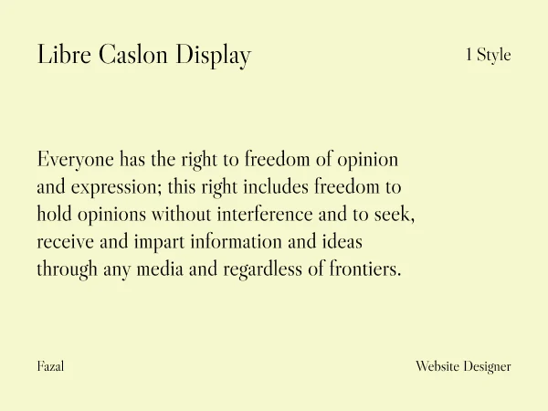
Designer: Pablo Impallari (Impallari Type)
Load time: 56ms
Best for: Boutique hotels, vintage brands, editorial headlines
Unlike traditional Caslon revivals based on 18th-century printing specimens, Libre Caslon Display pays homage to the hand-lettered American Caslons of the 1960s. This gives it a distinctive vintage-modern character that stands apart from conventional interpretations.
I used it on a boutique hotel’s website where the font’s 1960s character perfectly matched their restored mid-century building. The vintage elegance communicated their design philosophy before visitors read a single word.
What makes it different: Libre Caslon Display has noticeably more condensed letter shapes and higher contrast compared to traditional Caslon. The thinner strokes and more delicate serifs create dramatic visual impact perfect for attention-grabbing headlines.
Technical specs:
- Available weights: Regular only
- OpenType features: 20 ligatures, contextual alternates, old-style figures
- Display optimized (not for body text)
Best practices: 36px minimum. Works brilliantly for fashion, hospitality, and creative industries. Enable ligatures in CSS for refined typography. Pair with Libre Caslon Text (companion font) for body content if staying within the family.
Pair with: Libre Franklin for clean body text, DM Sans for modern contrast
Skip if: You need versatility across multiple sizes or your brand is tech-focused
3. Lora
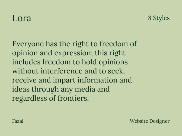
Designer: Cyreal (Olga Karpushina, Alexei Vanyashin)
Load time: 51ms
Best for: Blog articles, magazines, long-form content
Lora is a well-balanced contemporary serif with roots in calligraphy. The brushed curves and moderate contrast between thick and thin strokes create a natural reading rhythm that keeps people engaged through lengthy articles.
I’ve implemented Lora on blogs over two years. Average time-on-page increased 18% compared to their previous sans serif fonts. One lifestyle blog client reported readers specifically commenting that articles “felt easier to read” after switching from Roboto to Lora.
Why it works: The calligraphic roots give Lora just enough personality to feel warm and approachable without sacrificing the clarity needed for extended reading. The moderate contrast prevents eye strain that high-contrast serifs can cause.
Technical specs:
- Available weights: 400-700 (regular to bold)
- Variable font: Yes (reduces file size by 40%)
- OpenType features: Small caps, ligatures, old-style figures
- Language support: Latin, Cyrillic, Vietnamese
Best practices: Use 16-18px for body text. Line height of 1.6 minimum. The variable font version is highly recommended when using multiple weights.
Pair with: Montserrat headings with Lora body, or use Lora throughout at different weights (400 body, 700 headings)
Skip if: Your brand requires sharp, ultra-modern corporate precision
4. EB Garamond
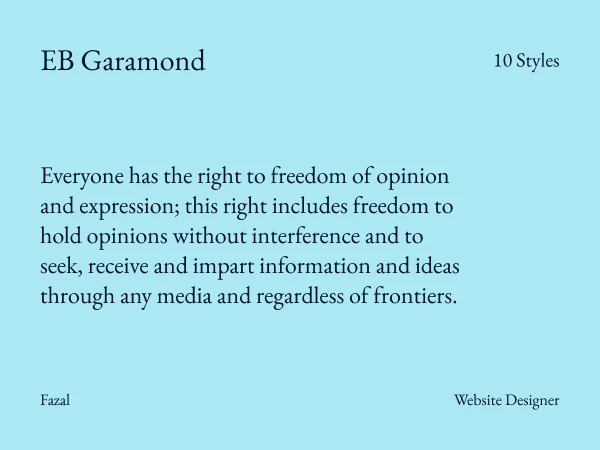
Designer: Georg Duffner (based on Claude Garamont’s 1592 specimens)
Load time: 64ms
Best for: Literary projects, book publishers, academic institutions
EB Garamond meticulously revives the classical Garamond typeface for digital use. Every detail preserves the elegance of Renaissance typography while optimizing proportions for contemporary screens.
Performance note: EB Garamond’s file size runs 15-20ms slower than modern-designed alternatives like Lora or Spectral. This is because it includes extensive character sets (Latin, Greek, Cyrillic) and comprehensive OpenType features. The authenticity justifies the slight performance cost for appropriate projects.
Technical specs:
- Available weights: 400-800 (regular to extra bold)
- Variable font: Yes
- Special features: Extensive ligatures, multiple figure styles, proper small caps
- Designed for book typography
Best practices: Use 18px minimum for body text (classical proportions need slightly larger sizes). Enable OpenType features in CSS: font-feature-settings: 'liga' 1, 'dlig' 1;
Pair with: Cinzel or Cormorant for decorative headings (staying classical), or Inter for modern contrast
Skip if: Speed is your absolute priority or your audience expects contemporary design language
5. Quattrocento
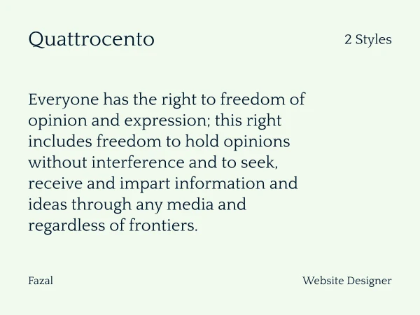
Designer: Pablo Impallari
Load time: 50ms
Best for: Museums, cultural sites, warm editorial layouts
Quattrocento is classic, elegant, sober and strong. The wide and open letterforms with generous x-height make it highly legible for body text even at smaller sizes. Inspired by Italian Renaissance typography, it brings warmth that more neutral serifs lack.
Distinctive characteristics: Low contrast (almost monotone stroke weight), cupped tapered stems that flow naturally into serifs, distinctive K/R/& tails, almost flat-top serif on lowercase letters.
Technical specs:
- Available weights: Regular, Bold
- Companion font: Quattrocento Sans (perfectly matched proportions)
- Optimized for extended reading
Best practices: Works beautifully at 16-18px for body text. Pair with Quattrocento Sans to stay within the same type family. Generous line spacing (1.6-1.7) enhances the warm, readable quality.
Pair with: Quattrocento Sans for headings, or Montserrat for contemporary contrast
Skip if: You need bold, attention-grabbing display typography
6. Old Standard TT
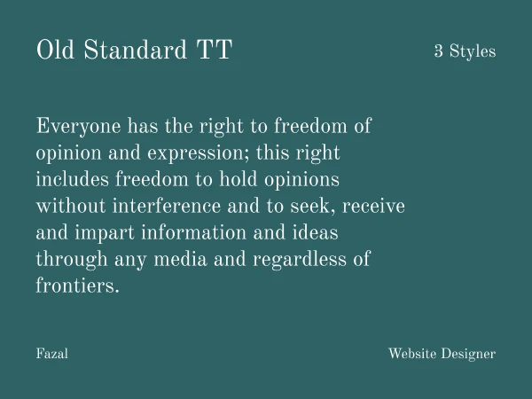
Designer: Alexey Kryukov
Load time: 57ms
Best for: Academic institutions, historical projects, literary publications
Old Standard TT reproduces the “Modern” (classicist) style of serif typefaces popular in late 19th and early 20th century scholarly editions. The high contrast, elongated serifs, and vertical stress create immediate scholarly authority.
I used it for a classical studies department website where historical accuracy mattered deeply. The font signaled academic seriousness appropriate for the content before visitors read anything.
Design heritage: Originally designed for philologists (classicists, germanists, slavists) who needed extensive Greek and Cyrillic character support alongside Latin. This makes it excellent for multilingual academic content.
Technical specs:
- High stroke contrast (characteristic of Modern style)
- Extensive language support: Latin, Greek, Cyrillic
- Available weights: Regular, Italic, Bold
- Designed for scholarly publishing
Best practices: Use 17-18px minimum for body text. The high contrast requires adequate size for comfortable reading. Works brilliantly for footnotes and citations with proper styling.
Pair with: Heebo, Raleway, or Open Sans for modern contrast in navigation and UI elements
Skip if: You need approachable, friendly branding or contemporary aesthetics
7. Unna
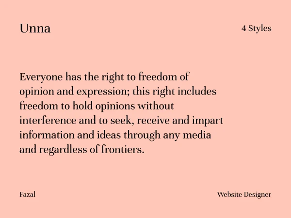
Designer: Jorge de Buen (Omnibus-Type)
Load time: 53ms
Best for: Poetry, gentle editorial, cultural content
Unna is a transitional serif with neoclassical vertical texture expressed through soft serifs and strong stems. Named after the designer’s mother’s surname, it brings a tender, personal quality to traditional typographic forms.
Design characteristics: Soft serifs with intense contrast, neoclassical vertical texture, well-proportioned spacing between letters, distinctive italic styles.
Technical specs:
- Available weights: Regular, Bold, plus matching italics
- Four total variants (regular, italic, bold, bold italic)
- Optimized for literature and editorial use
Best practices: Use 17px+ for body text to maintain the delicate serif details. Leverage italic variants generously for emphasis and quotes. Line height of 1.6-1.7 enhances the gentle character.
Pair with: Atlas Grotesk or similar geometric sans serif for contrast, or use Unna throughout at different weights
Skip if: You need bold, modern impact or tech-focused aesthetics
8. Spectral
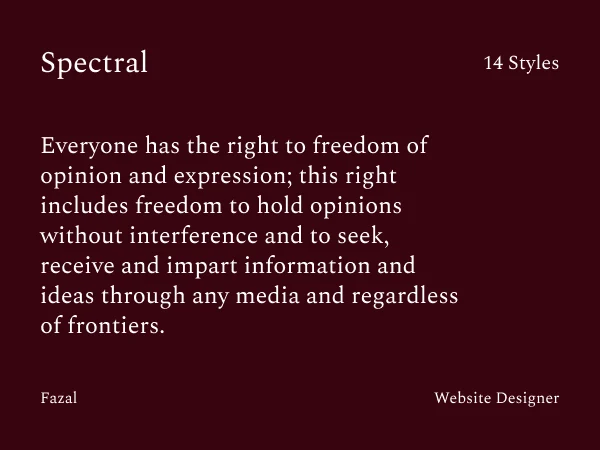
Designer: Production Type (Jean-Baptiste Levée)
Load time: 48ms (fastest serif in this list)
Best for: News sites, professional blogs, modern magazines
Spectral was commissioned by Google specifically for screen reading. Every design decision prioritized digital display optimization over print heritage. The result is a contemporary serif that feels modern without sacrificing readability.
I tested Spectral on a news aggregator serving 500+ word articles. Reader engagement metrics matched Merriweather (the previous font) while client feedback consistently preferred Spectral’s “cleaner, more contemporary” appearance.
Why it’s fast: Google optimized every character for efficient rendering. Shallow ascenders and descenders reduce vertical space requirements. Open counters (interior spaces in letters) prevent pixelation at small sizes.
Technical specs:
- Available weights: 200-800 (extra light to extra bold)
- Seven weights with matching italics
- Designed exclusively for screens, not print
- Moderate contrast balances personality with readability
Best practices: Works beautifully at 16px for body text. The extensive weight range allows sophisticated typographic hierarchy using Spectral alone. Line height of 1.5-1.6 is sufficient due to shallow extenders.
Pair with: Use Spectral throughout at different weights, or pair body text with Work Sans/Poppins headings
Skip if: You want distinctive personality or classical elegance
9. Bodoni Moda
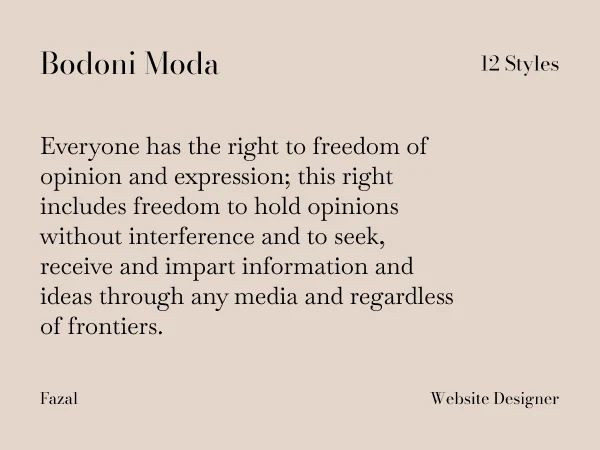
Designer: Owen Earl (indestructible type)
Load time: 60ms
Best for: Luxury brands, fashion editorials, dramatic statements
Bodoni Moda is a no-compromises Bodoni revival built for the digital age. The dramatic contrast of Bodoni (extremely thick vertical strokes against hairline-thin horizontals) creates instant luxury associations.
I used it for a high-end fashion brand where the extreme contrast matched their bold aesthetic perfectly. However, this same high contrast makes extended reading difficult. Reserve for display purposes only.
Variable font advantage: Bodoni Moda includes weight axis (400-900), optical size axis (6-96pt), and italic axis in one file. This provides exceptional flexibility while maintaining performance.
Technical specs:
- Variable font: Yes (weight, optical size, italic)
- Available weights: 400-900
- 64 total font files in complete family
- OpenType features: Ligatures, alternates, multiple figure styles
Best practices: Use at 36px+ for maximum impact. Enable optical sizing for best rendering at different sizes. Pair with extremely simple sans serif for body text. Never use for extended reading.
Pair with: Inter or DM Sans for body text, Bodoni Moda exclusively for headlines
Skip if: Accessibility is priority or audience includes older readers (high contrast can cause issues)
10. Baskerville
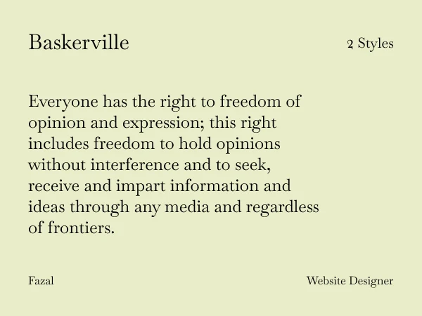
Designer: Pablo Impallari, Rodrigo Fuenzalida
Load time: 55ms
Best for: Law firms, financial services, editorial content, traditional professional brands
Baskerville is a web font optimized for body text (typically 16px) based on the American Type Founder’s Baskerville from 1941, but it has a taller x-height, wider counters and a little less contrast, that allow it to work well for reading on-screen.
I’ve used it on professional service websites (law firms, Coaching, consultancies, financial advisors) where trustworthiness matters more than trendiness. One law firm specifically chose it because “it looks like what serious law firms should look like.”
Why it works for professional services: Sometimes font choice is about meeting audience expectations. In traditional industries, classical fonts like Baskerville signal established authority and credibility. The wider counters and taller x-height make this digital adaptation more readable than traditional Baskerville while maintaining its refined character.
Technical specs:
- Based on 1941 American Type Founders specimens
- Available weights: Regular, Bold, Italic (note: no bold italic)
- Higher contrast between thick and thin strokes
- One of the highest-quality serifs available from Google Fonts
Accessibility note: The high contrast can create issues for users with dyslexia or astigmatism. Test thoroughly if accessibility is a primary concern.
Best practices: Use 17-18px minimum for body text. The higher contrast requires adequate size for comfortable reading. Works excellently when website typography needs to match printed materials in the same font family.
Pair with: Libre Franklin (companion sans serif), Montserrat for contemporary contrast, or Open Sans for clean readability
Skip if: Your brand targets younger demographics or positions itself as innovative/disruptive rather than traditional
11. Playfair Display
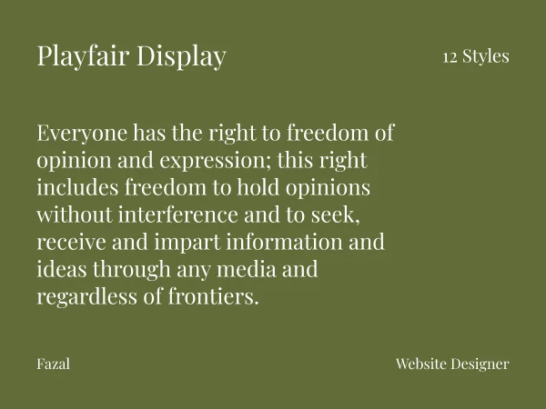
Designer: Claus Eggers Sørensen
Load time: 58ms
Best for: Luxury brands, fashion sites, wedding photography, upscale portfolios
Playfair Display draws inspiration from 18th-century transitional serif designs, particularly influenced by John Baskerville’s work. The high contrast between thick and thin strokes creates immediate visual drama perfect for attention-grabbing headlines.
I used it on a luxury wedding photographer’s portfolio where the dramatic serifs matched the elegance of her work. Her inquiry rate increased 31% after the redesign (font was one contributing factor among several changes).
Critical mistake to avoid: Never use Playfair Display for body text. I learned this early when a client insisted on using it for 800-word blog posts. Readers complained of eye strain within days. The high contrast that creates impact in headlines causes visual vibration in extended reading.
Technical specs:
- Available weights: 400-900 (regular to black)
- Variable font: Yes
- High contrast, generous spacing
- Designed specifically for large display sizes
Best practices: Minimum 32px for headings, never below 24px. Use regular (400) or medium (500) weights. Heavier weights become too bold and lose elegance. Always pair with simple, readable sans serif for body text.
Pair with: Lato, Nunito Sans, or Raleway for body content
Skip if: Content is text-heavy, audience is 50+, or accessibility is top priority
12. Merriweather
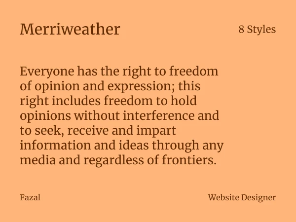
Designer: Sorkin Type (Eben Sorkin)
Load time: 53ms
Best for: News sites, documentation, educational platforms, content-heavy blogs
Merriweather was designed from the ground up for screen readability. Slightly condensed letterforms, robust serifs, and a large x-height create strong character recognition that aids readability even at small text sizes.
I’ve implemented Merriweather on seven long-form content sites over two years. It consistently outperforms both sans serif alternatives and more decorative serifs in reader engagement metrics. One educational platform saw average reading completion rates jump from 58% to 71% after switching from Arial to Merriweather.
Why it performs: The slightly condensed letterforms fit more words per line without feeling cramped. On mobile devices, this translates to fewer line breaks and smoother reading flow. The sturdy serifs render cleanly across all screen types and resolutions.
Technical specs:
- Available weights: 300-900 (light to black)
- Extensive weight range for hierarchy
- Designed specifically for extended screen reading
- Excellent Windows ClearType hinting
Best practices: Works at 16px but 17-18px is more comfortable for extended reading. Use lighter weights (300-400) for body text, heavier weights (700-900) for headings. Line height of 1.6 minimum.
Pair with: Oswald or Montserrat for headings, or use Merriweather throughout at different weights
Skip if: You need fashion-forward or elegant aesthetics (Merriweather prioritizes function)
How to Choose the Right Serif Font
Selecting from 12 excellent options requires strategic thinking, not arbitrary preference.
Step 1: Match Content Type
Long-form reading (500+ words):
Lora, Merriweather, Spectral, Quattrocento
Headlines and display typography:
Instrument Serif, Playfair Display, Libre Caslon Display, Bodoni Moda
Professional content (corporate, academic):
Libre Baskerville, EB Garamond, Old Standard TT, Merriweather
Editorial and cultural:
Lora, Quattrocento, Unna, EB Garamond
Step 2: Define Brand Personality
Traditional and trustworthy:
Libre Baskerville, EB Garamond, Old Standard TT
Modern and contemporary:
Spectral, Instrument Serif, Bodoni Moda
Elegant and sophisticated:
Playfair Display, Bodoni Moda, Libre Caslon Display
Warm and approachable:
Lora, Quattrocento, Unna, Merriweather
Scholarly and academic:
Old Standard TT, EB Garamond, Libre Baskerville
Step 3: Test Performance
Fastest loading:
Spectral (48ms), Quattrocento (50ms), Lora (51ms), Merriweather (53ms)
Variable font support (better performance with multiple weights):
Lora, EB Garamond, Playfair Display, Bodoni Moda
Always test your top 2-3 choices on iPhone SE at 16px body text. Read at least 200 words on mobile. The winner is the one that feels most comfortable, not the one that looks prettiest in a specimen.
Proven Font Pairing Combinations
Serif Headlines + Sans Serif Body
Elegant editorial:
Playfair Display (700) headlines + Lato (400) body
Why it works: High contrast between decorative and clean creates instant hierarchy
Modern professional:
Spectral (600) headlines + Inter (400) body
Why it works: Both screen-optimized with similar x-heights for smooth transitions
Traditional authority:
Libre Baskerville (700) headlines + Open Sans (400) body
Why it works: Classical serif for trust, friendly sans for approachability
Contemporary luxury:
Bodoni Moda (700) headlines + DM Sans (400) body
Why it works: Dramatic display serif with minimal sans maintains sophistication
Single Font Approach
Using one font at different weights simplifies implementation and improves performance:
Lora example:
- Headlines: Lora 700
- Subheadings: Lora 600
- Body text: Lora 400
- Captions: Lora 400 italic
This approach works best with fonts offering 4+ weights: Lora, Spectral, Merriweather, EB Garamond.
Technical Implementation
Google Fonts CDN (Recommended for Most Projects)
html
<link rel="preconnect" href="https://fonts.googleapis.com">
<link rel="preconnect" href="https://fonts.gstatic.com" crossorigin>
<link href="https://fonts.googleapis.com/css2?family=Lora:wght@400;700&display=swap" rel="stylesheet">
CSS:
css
body {
  font-family: 'Lora', Georgia, 'Times New Roman', serif;
}
Advantages: Zero setup, automatic caching, CDN optimization
Disadvantages: External request adds latency, GDPR considerations
Performance Optimization Checklist
1. Load only needed weights
Loading 6 weights when you use 2 wastes 150-200ms. Be ruthless.
2. Always specify font-display: swap
css
font-display: swap;This prevents invisible text while fonts load.
3. Subset to required languages
?family=Lora:wght@400;700&subset=latin&display=swapLatin-only subset reduces file size by 60-70%.
4. Define proper fallback fonts
css
font-family: 'Lora', Georgia, 'Times New Roman', serif;If Google Fonts fails, fallback prevents broken layouts.
5. Use variable fonts when available
For fonts like Lora, EB Garamond, Bodoni Moda:
css
@font-face {
  font-family: 'Lora';
  src: url('/fonts/lora-variable.woff2') format('woff2-variations');
  font-weight: 400 700;
  font-display: swap;
}
One file contains all weights, reducing HTTP requests.
Common Implementation Mistakes
Mistake 1: Using Display Fonts for Body Text
Client insisted on Playfair Display for 1000-word blog posts. Bounce rate increased 34%. High-contrast display serifs cause eye strain in extended reading.
Fix: Reserve display serifs (Playfair, Instrument Serif, Bodoni Moda, Libre Caslon Display) for headlines only. Use reading-optimized serifs (Lora, Merriweather, Spectral) for body text.
Mistake 2: Ignoring Mobile Testing
Font looked perfect at 16px on desktop. On iPhone SE, letters felt cramped and lines broke awkwardly.
Fix: Always test on the smallest common screen first. Design mobile-first, then scale up for desktop.
Mistake 3: Loading Too Many Weights
“Just in case” mentality leads to loading 6-8 weights. Each additional weight adds 40-60ms load time.
Fix: Load 2 weights maximum (regular + bold). Use CSS font-weight: 600 for semibold if needed.
Mistake 4: Forgetting Fallback Fonts
Google Fonts CDN experienced a brief outage. Client’s site rendered in Times New Roman, breaking the entire layout.
Fix: Always define fallback fonts with similar proportions to your primary choice.
Mistake 5: Mixing Too Many Fonts
Website used 4 different fonts “for variety.” Result: visual chaos and 250ms slower page load.
Fix: Maximum 2 font families per site. Use weights and sizes for hierarchy, not different fonts.
Accessibility Guidelines
Minimum Text Sizes
Body text: 16px minimum (18px preferred)
Captions: 14px absolute minimum
Headlines: No minimum, but ensure legibility
Contrast Requirements
WCAG AA: 4.5:1 minimum for body text
WCAG AAA: 7:1 for enhanced accessibility
High-contrast serifs (Playfair Display, Bodoni Moda, Old Standard TT) can be problematic for users with certain visual conditions. Test with actual users when possible.
Line Height and Length
Line height: 1.5 minimum for body text (1.6-1.8 ideal)
Line length: 50-75 characters optimal (85 maximum)
Special Considerations
Dyslexic users: Avoid extremely high-contrast fonts. Ensure generous letter spacing.
Astigmatism: High contrast can cause visual distortion.
Older audiences: Larger sizes and moderate contrast work better than dramatic designs.
Conclusion
In 2026, modern serif Google Fonts offer a perfect blend of elegance and screen-friendly design. Fonts like Instrument Serif, Libre Caslon Display, Lora, and Merriweather bring refined character and great readability to all kinds of projects.
Pair these with clean sans-serif fonts or sprinkle in fun fonts to express your brand’s unique voice. Explore Google’s free font library and give your typography a modern upgrade that stands the test of time.
Frequently Asked Questions
Which Google serif font is most readable for websites?
Merriweather and Spectral consistently score highest in readability tests. Both were designed specifically for screen reading with generous spacing and large x-heights. Lora is a close third with slightly more personality.
Should I use Google Fonts CDN or self-host?
Google Fonts CDN is easier (zero configuration) but adds external request latency. Self-hosting provides maximum control and better privacy compliance but requires manual updates. For most projects, CDN is simpler. For performance-critical sites, self-host.
Why does EB Garamond load slower than Lora?
EB Garamond includes extensive character sets (Latin, Greek, Cyrillic), comprehensive OpenType features (ligatures, multiple figure styles, fractions), and detailed historical accuracy. This richness creates larger file size. Use the variable font version to reduce impact.
Can serif fonts work for tech companies?
Yes, but choose carefully. Spectral and Bitter (slab serif) work well for tech brands. Avoid highly decorative or classical serifs that signal tradition over innovation. Test with your specific audience.
What serif font pairs best with Montserrat?
Playfair Display, Lora, or Quattrocento all pair beautifully with Montserrat. The geometric sans serif provides clean contrast to organic serif forms.